UPDATED: May 8, 2012 (please scroll down for updates)
I've decided to put together this piece for two reasons. Firstly being that my friends seem to like to gather at my 'latest' post, whatever it may be about, to chat. Since I don't post on a regular basis, for which I feel rather bad but non-apologetic, I need to freshen things up from time to time in order to simply provide a clean slate for us to write on.
The second reason is that for some reason my previous post certainly resonated with a few people out there in the blogosphere who took the opportunity to cast a little fun at yours truly by declaring "Short the hell out of the markets! AR has gone bullish!". I found that to be fairly amusing but at the same time a bit disturbing. Disturbing because the two or three people who jumped on that bandwagon apparently did not read that post. They had to have only read the "Title". Not only that, they then proceeded to draw the wrong conclusion from it and from that point the spin was on.
 In that post, I presented a case where an argument could certainly be made for higher prices. Indications for potentially higher prices were emerging from so many different sources that I just couldn't ignore them... including moving averages, momentum indicators and perhaps most importantly, market internals. But I also made it clear that the evidence was not conclusive, that I was struggling with it. And that's why it was entitled "Why Does it Agonize Me To Get Bullish?" The markets (as well as the indicators I was taking into consideration) were either at an inflection point where they were about to roll higher - OR - we were simply in a consolidation phase where prices could suddenly collapse. Both those outcomes could be supported by conditions which still exist this evening. The bottom line is that I didn't know which way the market was headed when I wrote that piece 7 short days ago. And I didn't declare that I knew. I still don't. I'm sure sorry about that but whoever out there 'does' know with certainty, I urge you to telephone me at your earliest convenience and help me out here.
So with those two reasons in mind, I'd like to present a study in exponential decay that is as legitimate as any other mathematical model and as legitimate as any other opinion out there. In fact this brief study doesn't even necessarily represent my 'opinion' but rather just a presentation of a result that is a distinct possibility. Because I still don't know with any degree of certainty which way the market is headed... certainly not this evening. Actually not "ever", not with "certainty". But what follows is a model that is completely within the realm of possibility and I won't be one bit surprised if the markets were to take the path shown in the charts and paragraphs below You may find it to be rather outlandish or radical or so bearish that those same people who chuckled at my bullish argument may now want to declare "Never mind... AR was only joking. He's gone insane now". To those people I'd only provide a friendly reminder that just as an exponential progression can develop like this, it can unwind in the same fashion in an equally devastating exponential decay. That's what we're going to look at here although we're certainly not talking about something that's anywhere near the same degree of severity as shown in that view of the Weimar currency experience.
In the weekly chart below of the S&P 500 we've combined two simple studies overlaid one atop the other and then used the two of them 'separately and completely independently of each other' to see if they point toward anything that might be common to both. Lo and behold, they both point toward a time slot... the first two weeks of August.
 |
| Click here for a live and updating version. We'll know real soon whether or not these targets are nothing more than whimsy or a little bit more real than that. For now at least, it's just a bit too interesting to dismiss outright. |
What is perhaps the more obvious of the two studies is the 'cycles' study shown by the yellow semi-circles. Admittedly, I'm not the biggest fan of these types of cycles because more often that not they have to be fudged somewhat to make them appear as legitimate in the first place although in this case I did not have to fudge them. But there is also the issue that the next low in the yellow semi-circles does not necessarily represent a low in the price of equities. It could be representing a high in equities.
What is less obvious though is the application of a relatively simple formula representing an exponential decay in the price of equities. As far as I'm concerned, that mathematical model is more legitimate than is the cycles study. Not because it's more likely to happen necessarily but because there are simply so darned many reasons why it "should" happen. I say that based solely on the fact that the reasons the markets got this high in the first place are themselves based on an exponential progression in the growth in the supply of liquidity to primary dealers who were then able to drive the prices of the American stock markets higher by 37% in the past 7 months. I mean... come on let's get real here.
In theory that liquidity could unwind just as easily and fast as it came into being. What? You call BS on that? Then I've to two words for you... Lehman Brothers. But let's be clear here folks, in no way am I calling for anything like a Lehman event in the coming months. I have no specific suspicions nor suspects to justify it. I don't know who could be next. All I know with certainty is that there are about 1000 choices to pick from. We certainly do have reasons to expect lower prices and this study is simply based on the theme that those lower prices are already in progress. Indeed, that may not even be the case. We're having some fun here... so cut me a little slack and let's just play 'pretend' for a while.
So how is the exponential progression calculated in this case? As opposed to a geometrical progression where every succeeding number in the sequence is multiplied by the same factor or percentage such as would be the case with your money compounding in a term deposit at Goldmans Sachs bearing the incredibly unprofitable rate of 1.75% per year for example, in an exponential progression each succeeding number is grown by applying an exponent. The only difference is that in this case we're considering "growth in the size of a correction". In other words "decay". Therefore the exponent is less than one. To be specific, in this case it is 0.7399. And where did that factor come from? From the growth in the size of the corrections in the spring of 2010 and the summer of 2011. "Pretty flimsy" the permabulls might say and I'd have no argument with that. Just as they should have no argument with my assertion that any reason to "expect" higher prices is exponentially weaker. Ok, so the application of an exponential decay results in a decline that is 26% larger than the last one suggesting a target of 1053 to occur sometime in the first two weeks of August. The cyclical picture also points to the first two weeks of August.
 |
| Let's face it, clones really do exist and they're everywhere |
Look friends, I have no illusions here. I have no reason to jump up and declare that "this is a sound analysis, this is the way the market is going to unfold." But by golly it's a fun exercise and it's not based on nonsense either. Although it absolutely is non-conclusive, it's more than interesting that what emerged is a price target and time target from one study and the nearly identical time target emerging from the other. Is that sheer coincidence that ultimately means nothing? Could be! But the nice thing is that we won't have to wait until the first week of August to find out. This entire study could theoretically be totally blown out of the water two weeks from now and I'd be more than happy to accept that and continue with my other studies. After all, that's what I do. Every day.
I hope you can see some merit in this type of analysis because let's be honest, it's as good as everything else out there that "isn't working these days". But in the event that you'd prefer to consider an exercise like this to be of little value, then I'd recommend that you don't waste your time reading this article.
UPDATE: May 3, 2012
A year ago I published an 'initial' article on the $CRX (commodities only related stocks) wherein I described how valuable it would be in the future (now is the future I was referring to) for confirming that a deflationary phase was upon us. I present the monthly chart with trend lines that go back 13 years. If this lower trend line is broken, consider it "confirmed"... there is a credit unwind in progress:
 |
| This is an amazing development. As predicted a year ago, that lower 13 year old trend line is being tested. I say it gets breached, providing evidence that a credit contraction is in progress. This event is definitely worthy of a new article on its own merit. Click here for a full blown version complete with a couple of indicators. |
UPDATE: May 5, 2012
Just to throw another couple of factors into the mix that we had better pay attention to, please consider this: The study above came to the conclusion that the S&P 500 may be headed for a price target of 1053 some time in the first two weeks of August. In reality, I think we should also pay very close attention to the fact that the week of July 1 marked a very important 'bottom' in 2009 and again in 2010. It appears that the illusionists like to use the great celebration of America's birthday to kick off spectacular bull cycles. Such an event could very well happen again this year. I have no reason to doubt it.
If that's case, if July 1-4 has been preordained as the start of another bullish cycle, we need to know approximately where the low in the S&P would be at that time. And according to the theory and evidence shown in the study above, whatever that low is it would most likely occur dead on that white down-sloping line. So with that in mind, I present the chart below. On it, we can clearly see a few key points... the May tops (short stubby red arrows) and the July bottoms, as well as the cloned down-sloping white 'angle of decent' line from the main study above. When we locate July 1st on that white line, and if the market is indeed going to find a bottom on that day, the magic number would be 1140.
So there we have it... two potential targets. 1140 on July 1 (which 'could be' the actual bottom), and 1053 some time in the first two weeks of August, should the 1140 level fail to hold.
 |
| In this chart, we 'respect' the July 1 lows that occurred in 2009 and 2010. If that occurs again in 2012, the S&P would be on the white 'clone' line at 1140. Click here for a live and updating chart showing some foreign markets. And here to see those foreign markets in candlestick form instead. |
UPDATE: May 7, 2012
The chart below is a great perspective by Pretzel on the US dollar as seen in the daily view. I agree with the bullish outlook wholeheartedly, an outlook which would concur with the notion that there will be no more QE in the immediate future. Perhaps if the US markets hit the skids as Europe is doing we might see the jawboning begin then. If nothing else a plunge in US stocks, and the fear that would likely accompany it, might provide some fuel for the FED to at least 'threaten' to provide more liquidity. Until that happens though, I think the outlook as shown below is probably pretty darned accurate.
[Chart provided courtesy of, and with the blessings of Pretzel Logic. A valued friend of this blog.]
 |
| Daily view of the US dollar courtesy of Pretzel Logic. |
The always-entertaining Michael Lewis:
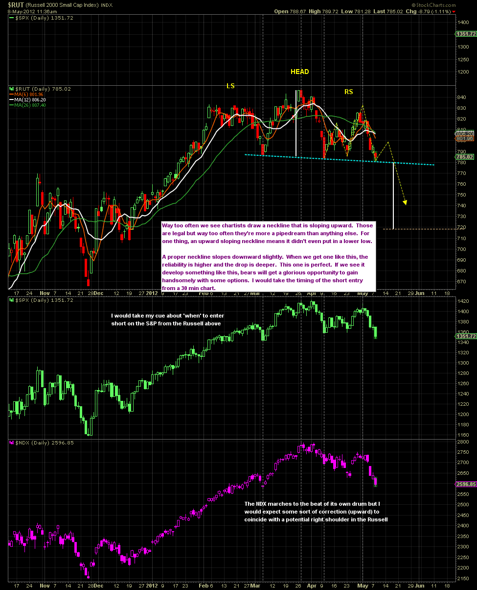
The Russell daily chart below shows the H&S developing very nicely so far. I'd expect a bounce to about 800 before the floor falls out. The measurable target based on the H&S would be around 718 as the 'minimum.
 |
| Click here for live and upbeat virgin. |
Wishing you all the best in the coming trading week...

Shouldn't the last sentence be at the beginning ? I'd already read it when I got to that part :-)
ReplyDeleteLol... I'm honoured that you got that far.
ReplyDeleteUSDJPY
ReplyDeleteI'll get the lazy bastards from BOJ out of bed, we're due one o them big bugger of a candles
At this very moment the futures for the US markets are playing possum. At the same time the Aussie:Yen cross is dropping yet again, probably headed for that 81 area. As is always the case, I'll just trust that good old currency market for the truth, the ES traders be damned. I say we close lower in the S&P tomorrow. Unless the currency pair suddenly reverses course for some reason. Can't think of one right now.
ReplyDeleteExcellent work. Now we have a benchmark to measure the progress of any pullbacks and judge if they're for real or not. We might also expect a counter rally to cross the descent line half way to 2/3 the way down before the ultimate bottom just as we saw in the first two declines.
ReplyDeleteAre they still on vacation in Japan? It looks like no one is trading the Yen right now.
ReplyDeleteAUDUSD is back around that 1.03 level that's been like magnet the past couple years
ah, yes, forgot about golden week...BOJ dudes will still be out at the all-night karaoke bars. Maybe one of them will stagger into the office on the way home, wielding an especially fat & clumsy finger. How do you say 'gazillion' in Japanese?
ReplyDeleteInteresting post AR, I recall you posting that chart in one of the previous pubs. What's more intriguing about this pattern is that it would assume that some sort of panic bottom forms at the yellow cycle date, but in the previous two summer selloff the market has corrected about two months prior to the bottom and then whipsawed tremendously for the next two months while massive NYSE short interest was built up prior to the next launch of QE as the late shorts were squeeeezed.
ReplyDelete..actually 'gazillion' is uncannily similar to 'Godzilla'. She has REALLLY fat fingers.(although in Japan they say it 'Gojira')
ReplyDeleteYou can tell I need to get some sleep , right?
Hey Albertarocks!
ReplyDeleteWell, tis the early hours of Thursday, I do like those circle/waves. I used to use them a lot on the hourly cycles for trading, used to prove quite useful at times. They are no good with determining price of course, but the cycle low/highs, they did help with that.
*I've been watching a few finance videos today, both were talking about the HUGE multi-decadal cycles. I find that kinda more interesting than all the short term stuff which remains mere 'noise' - even last summers decline was noise in the scheme of things. The Permabears ARE right about the underlying macro/socionomic trends, but as traders in the short term...our understanding of the grander picture, is adversely affecting our shorter term trades. I still struggle most of the time. Anyway, its just something from my world today.
-
I would be a little surprised if we don't cycle lower, at least to 1340 in the near term, but hey, it is indeed a very difficult market to be involved with.
I think, - and have posted as such lately, for those that do use 'good stops', the levels are very clear much of the time. Even the worse bear shouldn't be losing more than 5/10% in a trade if they are careful.
--
Always good to see a new posting from you...good wishes for rest of the week. We have the Friday jobs data, that might lead to more dynamic market moves.
goodnight !
Send them another letter! They seem to respond immediately to your letters.
ReplyDeleteFirst of all, excellent work Mr. AR! I like those equally sloping lines, AND the geometric series.
ReplyDeleteThe semi-circles, don't those make it look like the next top would be in August? And the correction might be after that? Down to that white line.
Secondly, I almost wrote back to some of those trolls, but I bit my fingers instead of my tongue. I was going to say why don't you respond directly to Mr. AR, you wimp. What's the mattah, you are blocked on his site? HAHAHAHA. They are just trying to get your goat. The losers. Your last analysis was good too. Good to be aware of the upward potential. Weird stuff going on these days.
euro
ReplyDeletegood ole fashioned TA
http://screencast.com/t/hASqG9jT
Noice post AR.
ReplyDeleteHow anal?
ReplyDeleteWell once I was a consultant and 15 of us were hired to estimate the liabilities of a company that went bankrupt insuring things related to 9/11/2011. We needed to determine the value of the claims, and how much companies would get paid. We were estimating hundreds of millions with little to go on. The trustees wouldn't be phased by these hundreds of millions of swags, but they would call and ask about $10 items. Completely missing the bigger squishy issues.
Tell me about it- I lived there for 3 years. That's a good point, they should be doing these retraces to the nano-pip.
ReplyDeleteI once got held at Narita Airport for 9 hours due to some beaurocratic nonsense with my work visa. They finally had to call THE Minister of Health (my job in healthcare) on the golf course to get me cleared.
I used to get so frustrated with their strive for perfection & inflexible nature. Bizarrely though, after work finished, give em a few beers and vomiting on your boss was seen with great hilarity and even celebrated. (On a boozy Friday night last train home witnessed something quitessentially Japanese - a young lady, worse for wear after a heavy night out, had to puke. But being the considerate Japanese person she was, did it into her handbag. How community spirited they are. Great bunch actually, loved it there.
Good stories! So you lived with their perfectionistic ways ... yep, I bet there are millions of them swarming the yen currency chart with fib extensions and rulers. Surely it's got the most well-behaved chart of all the beasts.
ReplyDeleteHa lol.
ReplyDeleteHerd mentality- We used to call them The Borg. Hey that gives me an idea - if only we can get inside a few Mrs Watanabes' heads with a subliminal message :"Sell the Yen"...soon they'll all be doing it. I like your image of them applying rulers & fibs.... Japan is where candlestick charting originated, from the rice market hundred+ years ago (via Steve Nison).
AR I do appreciate your take from a different angle most of the time. It does provide perspective to some of my own conclusions. Based on the weekly chart of the RUT back in the beginning of April I thought a 600 target around mid July was possible. I posted that on another site you visit. You never know I guess. I do know righ now the market is having a major battle on direction. As Mr. Doomster and others have said. Thanks again for your work. I do appreciate it.
ReplyDeleteThe new high in the DOW has me pondering whether June Swoon is off the table. I did pull up my DOW chart (which I never do) and was pleasantly surprised that so far it is actually not tracking the scenario that badly. I dunno. There is that fib confluence in the SPX 1427-33 range if the top is not already in on it.
ReplyDeleteJune Swoon
Nice currency charts DK and GIB. I took the night off. I am just long that USD/CAD DMI trade and bored out of my mind with it.
ReplyDeleteHey gang... sorry for being out of contact since this post was published. My daughter took me out for dinner at a quaint restaurant/pub tonight in a trendy old part of the city where we just sat, ate and listed to a live jazz band. Life doesn't get much better than that.
ReplyDeleteOne thing I'll keep in mind is that the first week of July has marked a major top or bottom for the past 3 years in a row. A bottom, another bottom, then a top. The idea of a major top or bottom occurring in the first week of July 'this year' doesn't jive with the theory I covered in this post. So one of the two is going to be wrong.
ReplyDeleteI admit that this post is a shot in the dark although there are certain take-aways that are very real, like the fact that all the declines have taken on an identical angle of decent. That's just not something we should be seeing in a normal world.
At first glance I think it's normal to assume that the yellow circles would be predicting that at the end of the cycle (first week of August) the market would be at a 'top'. But more often than not a cycles study like that is only showing "turns in the market" but it doesn't predict whether or not it will be a top or a bottom. You could very well be right. Maybe the yellow circles are accurate in the timing but it will be a top and not a bottom. It's completely possible that I'm wrong about my "theoretical forecast" that it will be a bottom. This post is really more about having a bit of fun with analysis that could very well turn out to be correct or could be dead in the water within two weeks. I wouldn't take it too seriously unless we get a nasty sell-off starting to take shape pretty quick here. If that were to happen, only then would I start to think that maybe this particular analysis might actually have a chance at being right. It's pretty radical to be honest... more radical than I usually allow myself to get.
ReplyDeleteHey SJ
ReplyDeletejust stick on a long USDJPY right here and go to bed
Yeah I agree Rob, the analysis above is very speculative and 'theoretical'. I'm not really 'predicting' that it holds up.
ReplyDeleteThanks for the explanation. Oh .... they show turns in the market ... I'm not used to those circles and cycle analysis. That makes sense. We'll see how it develops. More will be revealed. Good stuff.
ReplyDeleteThat's where I'm headed ... thanks all of you ruler-weilding and fib-practicing and group-thinking yen nerds.
ReplyDeleteGood to hear ... sounds tres enjoyable.
ReplyDeleteI ran another race with my daughter this weekend, and it was quite memorable. She took 3 minutes off her time on a hilly course ... 24:28 for a 5K, and she's 11. 7:53's per mile, and the only training she's been doing is some form work this past year (I read Chi Running and am teaching it to her ... it's all about efficient running form), and soccer and one mile a week. Wasn't even breathing hard. Her potential is shocking. She's 5 feet tall and has very long legs and weighs only 72 pounds ... she must be part Kenyan or Ethiopian! More fun than all of my race memories!
I like how the USDJPY got real tight last night (on the hourly), after coming up off the bottom and pulling back. Consolidation. Looking like mayber there are: No. More. Sellers.
ReplyDeleteCue the Japanese music ...
Good to take a night off to clear the mind and let that quiet inner voice speak. I took the past month half-off, and am waiting for trades to come to me. I think one just arrived.
ReplyDeleteI'm perhaps 0.5% Native American. Maybe I can make new friends as Elizabeth Warren has done.
ReplyDeleteAwesome angle of descent chart, AR.
ReplyDeleteNeat idea. Often in an 'abc' pattern or I think in an expanded flat we find that the angle of decent is very similar in those as well. But to be "identical", literally 'clones'... that's just off the charts crazy. Way too much to be a coincidence I'd have to think.
ReplyDeleteOh by the way, that giant H&S on the GDOW has a downward-tilted neckline.
ReplyDeleteGreg I don't mean to pry into your family business, but do you mind if I ask what color your daughter's skin is? Is she uh, uh you know... a little darker than you by any chance? That's some seriously good running for a young lady. Quite normal performance though for an Ethio..... never mind ;-)
ReplyDeleteAs I'd told you I'd do last time you and I spoke... I told my daughter your daughter's name last night. And my daughter's immediate reactions was "ooohhhhh how incredibly beautiful is that. Right out of an epic novel like Gone With The Wind." I'm telling you Greggor... that's a beautiful name, provided you say it properly, lmao.
Euro
ReplyDeletewant to see it get back to 1.32
Hahaha ... you're funny. She's very fair skinned. But my niece is semi-darker skinned, and she placed 8th in the nation in long jump junior olympics. So she inherited some speed ... my daughter will have to train to get fast ... the curse of the distance runner. She asked if she could place 8th in the country like her cousin, and I said she probably could, but she'd actually have to train! :)
ReplyDeleteThanks, I hadn't realized how the name sounded together. She is a very dramatic type, maybe movies are in her future.
Very interesting ... didn't realize that. And candle sticks and all those rules are very anal ... right up their alley. This is all starting to sound like we should be able to predict the USDJPY easier than some others. Hmmmmm.
ReplyDelete(3) = 1.5 * (1)
ReplyDeleteBeautiful-est waves of the day
Well if a H&S neckline that is sloping upward gets broken, too often price will stop somewhere that would create the "ideal" neckline (one that's sloping downward). But since we've already got a neckline in place that's sloping downward, the stage is already set. Yeah it's far more desirable if the neckline is sloping downward. The Russell has it too.
ReplyDeleteThe bank of England governor Sir Mervyn King will be replaced with a successor thought possibly to be a Goldman boy, Jim Oneill.
ReplyDeleteHowever, King is indicating his successor needs a strong historical background. This is leading to speculation that Bernanke may be a possibility.
http://www.guardian.co.uk/business/2012/may/03/eurozone-crisis-spain-debt-auction-downgrade#block-8
Personally, I dont know how that could happen. Yet in thinking about the 2012 presidential election, I guess indeed it could. Europe is in the grips of a recession quickly spiraling into a depression. They are getting that austerity measures are not fixing the problem and it is evident at this point they are only talking about the need for growth yet have no plan for bringing it on.
There's a difference between friends and "real friends", lol.
ReplyDeleteYou'll find "real freinds" here I think.
USDCAD is getting a little froggy here...daily DMI setup still valid
ReplyDeleteThe thing to really emphasize (and I'm sure you do) is that she attained a "personal best" in her most recent run. The younger athletes almost always do, being unaware that the day will come when a new personal best no longer happens "every time out". But by that time they're very accomplished in their sport. So as always happens in the swimming world where my kids grew up, all the young swimmers were praised highly for achieving a "personal best". That way it gets ingrained in their thinking that they are 'winners'. I can't emphasize how powerfully that effects their thinking as adults. Both my kids are adults now, and the confidence they hold is very impressive to their dear old dad. Mission accomplished, lol.
ReplyDeleteMy daughter and I were talking about that last night... both of us very much relieved that Carney seems reluctant to leave Canada. We 'want' to believe that he's a loyal Canadian first, and a Goldman goon second. But we don't have our heads in the sand either. We're very happy to have him stay put.
ReplyDeleteRUT is performing beautifully. Running on all 8 cylinders today, downhill.
ReplyDeleteYeah, cycles analysis doesn't consider tops or bottoms, just "turns".
ReplyDeleteBest that Canada hold onto it's own. Isnt it amazing what people can do with their lives?
ReplyDeleteBeautiful daughter AR! Good job daddy!
I have her beat by an inch.
You're kiddin' me. You're a 6 footer? You belong in Calgary because I'm not kidding there are more women here 6 feet and taller than in any city west of Amsterdam. I have no idea why that is. Want to see my son next? lol
ReplyDeleteI'd love to see your son!
ReplyDeleteYep, DL's got LEGS, and that's my handle when I'm on the radio on my bike. My dad was quite the ball player in his day at 6'7" along with Bill Russell.
I'm a scrawny 6 footer. My eldest daughter is a professional model and she's 5'11" too. They like em tall and thin for some reason.
Yes, very good perspective ... personal bests are awesome in training them to always improve (rather than win) and think positively. And your daughter achieved some truly amazing things in her sports. Glad to see that confidence carried on in her life! My wife has trouble with that concept being a basketball player. Taking 10th in a regional meet is a great thing if it's a PR!. Once she said she was going to win her swimming race, and I said what if Michael Phelps is in your heat?
ReplyDeleteHere's a new fledgling support line on a new uptrend in USDJPY:
ReplyDeleteI think it could be a solid support line near 80.30 given how tight the hourly support was overnight.
Fantastic. Wow, your daddy was a bruiser. My dad played baseball, as did I and my son. My dad pitched until he was 54 years old, lol. Baseball, not some candy-assed slow pitch. My daughter is too muscular to be a thin model. But she has been asked to model womens' 'large sizes'. She's not fat enough for that IMO, lol. Stay tuned, I'll show you my little boy soon.
ReplyDeleteLooks ready to drop hard from here in a
ReplyDeletethird of third down from yesterday's peak
Doors fan I see
ReplyDeleteGood kid
Yeah he's a good guy, the hardest working individual I've ever met. Became a commercial pilot at age 22 but went to the oil patch instead, lol. Pay is better. One time he worked 17 hours a day for 89 day straight. Made a few dollars on that hitch I can tell ya.
ReplyDeleteGot my fingers crossed on that one.
ReplyDeleteAnd here is the monthly chart on USDJPY.
ReplyDeleteRevisiting the middle of the bolinger band from above ... new support?
After 5 years of living under that line.
Thanks for sharing the picture of your son, and I remember you shared your daughter's picture awhile back ... good looking kids and they look like good-hearted kids. And his friend is nice too.
ReplyDeleteHer picture was up here earlier this morning too :-) Don't like to leave 'em up for long.
ReplyDeleteLet me see if I can get the running picture up here. hmmm.
ReplyDeleteAB just read your post - great stuff. Thanks.
ReplyDeleteODG ... exporting more goldman people or Bernanke. Like they would help anything. What sad, sad news.
ReplyDeleteWow.. what great runners and good lookin people!
ReplyDeleteboo hoo I missed the pic of your son! Next time!
ReplyDeleteThanks DL! You're very kind. She lopes along making it look easy. And she's a good kid.
ReplyDeleteYou may have some internet friends looking to relocate to Canada in your town :)
ReplyDeleteI put 'em back up for ya. Let me know when you've seen them so I can take 'em down again, lol.
ReplyDeleteI agree with DL... you're good lookin' people. Way to go dad. Much respect.
ReplyDeleteDon't have a good feeling about this at the moment. The fact that wave one of 3 didn't get higher than 1 gives me some pause. I'm wondering if we get a zigzag down to 80.2 and we're in the B part of it.
ReplyDeleteYes, I'd thought that might happen in the future. If nothing else, I'd sure be a good guide. I don't have the wealth to house people but I'm working on it, lol.
ReplyDeletehttp://i835.photobucket.com/albums/zz279/SoulJester/AUD_Updated.png
ReplyDeleteThanks Al. I realize and admit that this one is a bit quirky and a bit of a long shot. But right now it looks like the floor could fall right out of the markets. And in that case, I'd have to give the analysis above a bit more credence.
ReplyDeleteGF (and I don't mean "girlfriend"), if you're concerned because you're trading that pair, I'd agree with you. But if you're concerned because of what you interpret it's meaning would be for the equities markets I'd say don't worry... it's the Aussie:Yen that matters far more.
ReplyDeleteI agree with what your saying about the AUD/JPY
ReplyDeleteI'm concerned because I'm long as a mother USD/JPY
WOW! You have TWO great looking kids AR! Congrats on the offspring Daddy!
ReplyDeleteI think your son is a wee bit nervous around that scantily clad woman... I notice he just can't put his full hand on her!
LOL
Thanks for your thoughts/observations. I'll look out for that also. That would be an ABC down to 80.2. That certainly looks possible ... and likely. I was buying in at 80.36 because I was bummed I missed the 80.13 yesterday. :)
ReplyDeleteHere's some hope for ya then. See the momentum indicators? They're definitely trying to turn higher. Note the pink 6 day MA... and look at the price of 6 days ago. There will be big pressure tomorrow and Monday for the candles to either continue lower or that MA is going to turn higher. That's what you want to see and I think it's gonna happen. IOW, the pair holds up and that MA rolls upward.
ReplyDeletehttp://stockcharts.com/h-sc/ui?s=$USD:$XJY&p=D&yr=1&mn=7&dy=0&id=p14667353621&a=243814888
So Greg's hourly charts might be suggesting one more small leg lower, but the daily suggest it won't fall far. I've got the fingers crossed for ya.
Thanks buddy! I guess I'll take them down now, glad you got to see her. Kids are da best. And you appear to have raised to happy adults, and all the best on that life accomplishment.!
ReplyDeleteHey, I just noticed the USDJPY seems to have some cycles every 13 weeks on the weekly chart. At least 4 of them ... but I don't know how to make a chart like that ... you might want to take a look at that. I think we're at one now (a bottom).
ReplyDeleteYes he's a gentleman when being filmed. But I'm not so sure he kept his hands off altogether. I kinda doubt it, lol.
ReplyDeleteother possiblity is we are still in one of (3), with (v) to come now
ReplyDeleteSOX is breaking down.
ReplyDeleteNice thanks!
ReplyDeleteThat's what I'm thinking that we're in one of 3 up (although I'm calling it [i] of 3 but I probably mess around far too much trying to figure out what label & degree to put on the chart).
ReplyDeleteI've still got in the back of my mind, however, that the decline from March may not be complete. We haven't broken any meaningful trendlines or had any meaningful overlap with the down waves yet. Close but not quite yet.
I hate to jink anything but it sure looks to me like TZA could explode higher at any moment. The Russell is only hanging on by a thread.
ReplyDeleteagreed . if we can clear 80.70 , then 81, I'll be much more confident
ReplyDeleteI keep waiting for the 5th wave to bottom but it just keeps going down.
ReplyDeleteLooking really bearish at the moment
138.60 is the monthly average in SPY. CRX broke its corresponding arear this morning. IWM and QQQs are breaking it right now. AUDUSD broke that channel. USDCAD going for the daily buy signal (should be inverse to equities) right now. And VIX working on that buy signal. Oh the excitement.
ReplyDeleteOh, and little blue line still in tact...lol
ReplyDeletehttp://youtu.be/rEm5EWL7seY
ReplyDeleteI'm not sure you can delete that photo. But I can do it if you like... have to delete the comment though.
ReplyDeleteJim O'Neill the Goldman guy is a yorkshireman,not your typical Goldman type,and a good economist
ReplyDeleteI click on that link and here's what I get:
ReplyDelete"This video contains content from SME, who has blocked it in your country on copyright grounds.
Sorry about that."
I'd like to think the same of Carney. I know those Goldman arseholes are crafty but Carney really 'does' seem like a staunch patriot. A very, very sharp guy though, which would make him dangerous to all of us if he's truly on the dark side.
ReplyDeleteStrange. I can click on it. Canada?
ReplyDeleteNow is where bears should be noivous
ReplyDeleteYes, I wasn't able to delete it ... so when you get a moment, I'd appreciate it ... Having Wagner lurking around creeps me out with photos of my daughter around. Thanks!
ReplyDeleteYup. There's a lot of video media that originates in the USA that they won't let us see up here. Ticks me off big time, as if we were dirty foreigners or something.
ReplyDeleteJust a quick note to friends here who might notice one comment by our buddy Greg was removed. Just wanted to clarify that it was a great comment but was removed at his request.
ReplyDeleteThe comment above was removed at Greg's request. I was a nice comment, no problems with it.
ReplyDeleteSpot on on the bounce for AUD.....DK!
ReplyDeleteMerci buckets aussie
ReplyDeleteOn the other hand, some pretty darned nice H&S patterns were confirmed today. So we could very well see a bounce back up to the necklines but that would likely be about it. Weeeeeeee!
ReplyDeleteYou mean to ell us that that can happen when the market is dropping too? lol
ReplyDeleteSOX continues to get hammered. Here's a link to that chart above:
ReplyDeletehttp://stockcharts.com/h-sc/ui?s=$SOX&p=15&yr=0&mn=0&dy=10&id=p03451723097&a=266215302
Yen done?
ReplyDeleteRoger. Just saying noivous arear, not saying anything other than that. Little blue line trading continues......
ReplyDeleteWouldn't it be awesome if we could just hold short positions and not be overly nervous about it? A luxury reserved for bulls most of the time. I can't wait until the day I can go bullish and really "really" believe it's the right thing to do... and so does the FED.
ReplyDeleteIt is fairly interesting here to me. First touch on an upsloping 78 sma on the hourly is a buy for me. Big guy. First touch on a downsloping is a big sell for me. It is not 100%. I am not and did not buy it today because of VIX and watching USDCAD and some other things bigger picture. But I do respect it, so it makes me a wee bit nervous. Fascinating and nearly impossible moves here to trade, which is why I am trading less and little blue line-ing it--would rather be wrong than whipsawed.
ReplyDeleteI am leery of posting this because it is really, really subjective. But I am trading off objective things so that is okay. My gut told me not to hit that trade long today. I don't know if intuition is right or not. I didn't short based on that, I just took the pitch and didn't swing. A time I saw a failure on this that was significant was the inverse at the low (cut right through a downsloping for the run up). So, this interests me because SMAs are telling me we may be in a mirror of the low. Here is another (come on with the fucking signals already SJ!) signal. Don't stop little blue lining or whatever ya use, but I am telling ya this is exactly what I am seeing (the inverse, the mirror opposite).
ReplyDeleteMirror Opposite?
Now, I am trading best when I am little blue lining and figuring out whats to trade what the chart is giving me rather than trading predictions, but this is reallly interesting giving the cycles and your current post and how it jives with that DOW chart. Best thing I know on something like this is to know where you are wrong, prepare yourself to act when you are wrong, and if you do you will be right in the end either way. Hence, little blue line.
Note: I am prepared to buy this if it is wrong. Have to be. Because then it is like the 12/28 touch and ramp and I don't know where it ends (first level at 1426-44). Anywayzz...very subjective but why I have been looking at multiple markets and signals here and markers for where we at. Little Blue Line.
ReplyDeletejust woke up.
ReplyDeletenice call on ZZ
but has to fly from here.....or a mess... & new lows?
Hmm, I'm thinking about maybe going short here.. OH WAIT THAT'S RIGHT I'VE BEEN SHORT SINCE THAT FAKE-OUT ABC IN NOVEMBER.
ReplyDeleteAt least I had the good sense to go mostly unleveraged and stay 60% in cash.
But the bigger annoying thing about EW for the last two or three years has been watching the projected top moved ahead to next week every freakin' week. Always one more leg up. Until the real top arrives and the one more leg up never happens.
Grr. Begging everyone's pardon. It seems my social mood has declined a bit today.
Not looking too promising
ReplyDeleteyeah looks bollocks now.
ReplyDeletenew low coming?
I agree with DK ... nice call on the lower squiggle on the Yenster.
ReplyDeleteExcellent mirror fractal .. thanks! We'll know soon how this resolves, eh?
ReplyDeleteThere is positive divergence on the squiggles.
ReplyDeleteLets see what the bounce looks like
That was Daneric's rule. The lower degree 1 wants to progress past the upper degree 1.
ReplyDeleteIf it doesn't make it, I've found it is often a ratio. In this case it was about 50%.
USDJPY
ReplyDeleteAR, your cycle analysis inspired me to notice a 13-week cycle in the yen.
And DK's discussion last night about anal japanese currency traders also.
It's been in a nice 13-week cycle for about 6x13 weeks ... with this week allegedly marking the low point of this cycle.
Greg
Good wishes for Friday AR.. and your legion of readers.
ReplyDelete--
Baring a 200k number, surely we'll see a break into the low 1370s tomorrow, intra-day bounce, then falling into Monday. Near term target is dow 12200...so, looking for around 8% off the main indexes...days..rather than weeks.
-
Goodnight !
nice, thanks for sharing that nugget!
ReplyDeleteWowzer. Good to keep that possiblity in mind as that's the kind of risk underlying this market.
ReplyDeleteI wrote about an inflation assumption project I'm presenting at work.
ReplyDeleteSo far the rumblings are that the managers realize I'm right, and have nothing to refute inflation has been at 2% for four years for property related claims. But they have been assuming 5% to 9% for those years, and 5.5% for 3 years into the future. Making our rate need estimates 15% too high. And they are in the middle of filing for 25% rate increases countrywide because of this imagined inflation. And other compounding errors.
Greenface
And instead of worrying about losing all our customers, they are worried about what the big boss will think if we say oops we didn't need that big rate increase. So they are going to bury this study.
The best solution is at the intersection of what's good for the individual AND for the group. The company will suffer if they all try to save face. But 10 people so far that's their reaction. As we head into a deflationary environment ... hell, it's already been low inflation for 4 years, and still they expect it to pick up any day.
These guys are beyond clueless. I may have to go over their heads closer to the top. Because they will run the customers off like Netflix did.
Unfuckingbelievable.
I just submitted my resume to the government because these guys will run off half our premium (revenue) and then the expense ratio (our salaries) will be too high and they will cut our jobs. Now I know how whistle blowers feel ... going above all the managers is also career suicide.
Underwriters! Isn't there a marketing coalition to provide some balancing force?
ReplyDeleteI think that's where we are headed. The CEO pompously declared at an earnings meeting that we were going to take rate, and our competitors would follow ... Sure that competitors were facing these same inflationary forces. So in a year .. our rates will be too high relative to the market, and we many will cancel with us and go get a 25% reduced cost of insurance elsewhere. THEN we will lower rates, but the agents will be like GFY, and ... the goodwill will be ruined. The underwriters were seen as too loose with the discounts, and now have their hands tied. They were all told to get in line and take the medicine.
ReplyDeleteUSDJPY
ReplyDeleteOK, so maybe another low coming......uuurrrgh.....BUT......it's not all bad news..
..peak of (1) was 79.49. So if we get a low more than a few pips under this level we will have 1-4 overlap, which would mean THIS MUST BE WAVE 2.
Amigos, think about the implications...
Tommorow is May 4th 2012. The anniversary of May 4th 2011 the last day of 5 tight days in a row marking the bottom of the dollar. I think this is a reason it could surge starting Monday.
ReplyDeleteThe UUP is sitting on the 200dma on low volume. The AUD is below the 200dma and selling volume is picking up. The EUO (inverse of euro) is sitting at 200dma on support on low volume.
The currency market is all set to explode next week, after May 4th.
I think short is picking up odds here.
ReplyDeleteGulp. Wow. Hmmm ... that would mean that we only had a 1-2, i-ii, and i was rather huge meaning iii and 3 are going to be hurricane sized waves? When you zoom out, that 76 to 84 and back to 80 looks like a lump.
ReplyDeleteEURO 30min
ReplyDeletehttp://screencast.com/t/RrZXjBfsNX
I'm from an insurance company background, so this all sounds familiar. My advice to you is to diplomatically and deferentially say what you need to say, but keep yer ass covered -- but you probably know this anyway.
ReplyDeletethank you for the advice! The politics is not my strong suit.
ReplyDeleteNor is it mine, which has something to do with my no longer being in the industry.
ReplyDeleteThe best career advice I ever got (which I didn't follow) was "always CYA."
How about a double zz down from 80.61?
ReplyDeleteSounds a bit similar something going on with property management in this area. Wages have stagnated, but some apartment companies have raised rent over 15% in two years. They're losing tenants of course. Go figure.
ReplyDeleteYes, and I'm not sure what that looks like here ... if my boss' boss' boss doesn't want to reflect real inflation, not sure if it just means I document that I told him. Save the email so it doesn't disappear in 30 days. Or if I go above him.
ReplyDeleteBut I hear you ... i'm feeling like it's time for a career change. After 24 years. This group think is becomming intolerable. Well done getting out.
Dear Dollar,
ReplyDeleteHappy 1st Year Anniversary of yo bottom!
Where do you go from here?
Greg
Great advice. Lots of inflated but threatened egos in the corporate world. You can be right, but you have to be right diplomatically. Because some managers carry a grudge against people who are right when they think it makes them look wrong.
ReplyDeleteThe last 15 min candle was the dojiest doji imaginable.
ReplyDelete56 pip range but only 1.3 pips difference between open & close
In the insurance world you can make money 4 ways:
ReplyDelete1. difference between loss and premium (underwriting).
2. investment income,
3. lower expenses.
4. raise rates.
The first two aren't working, so they are cutting peole, and trying to raise rates. They can't believe in a world where rates are declining ... it's outside everybody's experience (deflation). So that's a given in their mind. That's the only lever left. They don't see that pulling that lever makes things even worse.
That's for sure ... everyone is feeling edgy about their job (declining social mood), so they all gotta save face for fear of the axe.
ReplyDeleteLet me know when the convulsions end
ReplyDeletehttp://www.youtube.com/watch?v=S716JoDmLbs
stole my stop in USDJPY, had to buy it back. Bastards.
ReplyDeleteFelt like I got pickpocketed. Forgot about the 8:30 jobs announcement (aka a reason to run stops).
ReplyDeleteYeah I like to wait it out until it's done. There's always spasms in both directions
ReplyDeleteWhat a disgrace:
http://www.zerohedge.com/sites/default/files/images/user5/imageroot/2012/05/Participation%20Rate.jpg
absolutely
ReplyDeleteI've speculated before that HFT stop-gobbling explains a lot of the wild chop and gyrations over the last couple of years. Traders get tired of HFTs finding and running their stops, so they set them wider, and the HFTs just reach out further to detect them and gobble them up. So the market swings wildly.
ReplyDeleteUSD/CAD currency marker for this week. Update. (Had a very nice inverse correlation to equities during the 2011 sell).
ReplyDeletehttp://i835.photobucket.com/albums/zz279/SoulJester/USD_CAD-Daily_Marker.png
http://i835.photobucket.com/albums/zz279/SoulJester/USD_CAD_Hourly_Marker.png
Happens a lot.
ReplyDeleteTo the point where support and resistance levels pretty much mean the opposite of what they used to.
They are targets to be broken.
I think there's a connection there somehow with Daneric's rule referenced earlier about lower degree 1 waves wanting to break past higher degree 1 waves.
Yay! Interesting version. I wonder some times whether people will realize in my lifetime how we lived with the greatest musician and song writer in centuries. It is so strange to me that so many think he just sounds funny and disregard him. But, I will save that argument for another day!
ReplyDeletehttp://youtu.be/A4qBYJ00230
ReplyDeleteThere have been enough indices now, where the pullback has dropped below the level which would be considered as wave 1 of the 5 which made up the previous wave up (the one we don't know if it's a 'c' wave or a first wave of a fiver). All the Euro indices and now IWM. But the Russell hasn't confirmed. If I'm not mistaken, this proves that the entire move up off the Nov. low was a great big fat 'ABC' and not the start of a new bull cycle. Would anybody out there draw that conclusion too or should I just go back to sleep, lol.
ReplyDeleteYou can see the level I'm referring to on this chart from the last post. On this chart I've labeled the key level with "confirm overlap". As you can see, the overlap hasn't happened on the S&P either. But I think it's key. What do you thimk?
QQQs and IWM have lost their monthly average. SPY below it with a wick hanging on for dear loife.
ReplyDeleteThat was Dylan's reggae tour. Right after his divorce and right before his 'Born Again' phase.
ReplyDeleteI sometimes watch some of those documentaries like 'Don't Look Back' or recent one on PBS
'No Direction Home'
and wonder if even he knew what an incredible genius he was.
Was just listening to
'Love minus Zero/No Limit'
it has biblical allusions, dialectic philosophy, Blake poetic references, and the title is derived
from the Kelly Criterion
all wrapped up in a sweet love song. Amazing
Awesome. Thanks for that.
ReplyDeleteOne of the most amazing songs is "Lay down your weary tune." I am sure you know it.
"Christian theologian Stephen H. Webb has linked many of the images of the song to the Bible and calls it "one of the greatest theological songs since King David composed his psalms."
http://youtu.be/O-qe6FSPnOk
Long USD/JPY. SPEC.
ReplyDeleteHaven't heard that one before.
ReplyDeleteBeautiful thanks for sharing it
They're absolute thieves especially in regard to the steroided ETFs. They run the EFT up to grab a bear's stop while the underlying hasn't budged one penny. It's nothing short of flat out theft. Seriously, people running that gong show should be hung by their balls from the traffic lights at the closest intersection to Goldman Sachs' building. Just a friendly reminder about what we do to horse thieves.
ReplyDeleteYeah, I hadn't either. He didn't release for some reason for a long time I think. Somebody sent it to me the other day and said I had to listen to it. I was pretty blown away by it and starting reading a bit about it.
ReplyDeleteOn SPX, we have already sliced through the 61.8 of the April 23 - May 1 wave up. Sliced right through it. This is the 78.6 arear....
ReplyDeleteDid I ever introduce you people to Andy McKee? Now this is what incredible American innovation is all about. Just a guy from Kansas doing his thing. It's freakin' awesome just to watch Andy go Drifting.
ReplyDeleteThat's another one I can't watch.
ReplyDeleteUSDJPY is really holding up well here during this equity sell...interesting...
ReplyDeleteAndy Mckee is awesome
ReplyDeleteQuite a player
Good songs Dylan songs
If you want you can download them here:
http://www.4shared.com/folder/Ck0PegdF/_online.html
There's a lot of support in this area going back years
ReplyDeleteMay the 4th be with you!
ReplyDeleteI need a shower...just back from troll land !! a beer would be nice too.
ReplyDeleteLol... the idiot clearly needs medical help. 125 comments out of 400... are you kiddin' me? And lies, holy smokes he flat out lies where there is ample proof to disprove him. He's literally insane :-)
ReplyDeleteTrue.Bobom was back today...must have have wondered why he bothered.
ReplyDeleteHey AR,
ReplyDeleteNice work. Love the charts, the cycles, the slope theory, etc. I've been studying this stuff for a while, and can't get over how effective parallel trend lines (or channels) can be in indicating turns. How else to explain a chart like the first one?
The second one is just something I noticed today. Not sure what it means, except that markets are just not driven by fundamentals much anymore.
Cheers!
PW
there was an interesting move in JPY in morning trading
ReplyDeletehttp://online.wsj.com/article/SB10001424052702304020104577384431588157406.html
"moments before the release of the monthly employment report.... stocks and bonds also started to move in what traders said likely were computer-driven buy-and-sell orders generated in response to the move in the currency markets."
He's a great guy. He should come over here.
ReplyDeleteI appreciate your posts. Helps me with a larger perspective and vision of what the future may portend. I need to balance this with short term trading and not let it dominate my immediate thinking. Thank you!
ReplyDeleteHey buddy... haven't seen you in a while. Sorry I don't get over to your house much either. Just too darned much on the plate these days.
ReplyDeleteYeah, I admit the study in this post is fairly radical in a way. But the fact that 9 of those pullbacks have an "identical" angle of decent is no accident. There's something behind it but of course I don't know how it works exactly or who's behind it. But that's no accident. Any two of them having an identical rate of decline would be an eye opener of a coincidence. But 9 of them?
But I sure do study a lot of other things. And I write articles on about 8% of it, lol. For example, the lowest chart on the post above, the one about the CRX... that is a 13 year trend line that just got busted. The signal it's giving is that a major deflationary event is likely in progress. I first wrote an article on that phenomenon a year ago, anticipating that it would eventually test that lower trend line. Well it's now one year later... and the event 'did' occur as predicted. So I'm going to have a hell of a hard time yet again trying to convince myself to get bullish, lol. But bounces... you bet, I'll be totally open minded about big bounces and I'll be fully prepared to participate in them. I can't get bullish on a market that has doubled in three years or one that has risen 37% in the past 7 months. But after a pullback? You bet... I'll be far more open to a long position once an honest pullback has occurred.
Nice to hear your voice man. Congrats on your new website. I wish you nothing but success... as always.
Have a great weekend. Take some time and relax like buddy here:
Hey AR. Please email Dan and tell him how to get rid of the nasty plague, you must know the secret! LOL
ReplyDeleteGood work keeping that moron out of here.
Good trading to you
That is a really good theory, except for one thing. We all like to go there to check on Dan's charts and sometimes you find a nugget or two in the board. Use to be tons more of course, so many have left.
ReplyDeleteKeeping eyes on Greece and elections over the weekend
ReplyDeletehttp://www.guardian.co.uk/business/2012/may/04/eurozone-crisis-elections-greece-france
"Not quite sure what to make of this - clearly the timing is interesting, ahead of the elections. Plenty of economists, city traders, commentators, and readers, believe Greece will eventually exit. Three triggers appear likely, either
1) Greece fails to hit the financial targets agreed with the Troika, and is deprived of its bailout cash;
2) The Greek parliament cannot agree the details of future austerity cuts
3) Sunday's election delivers a very divided parliament, with strong support for anti-EU parties."
And then there is the French elections May 6
http://www.businessinsider.com/french-elections-will-germany-bend-for-the-euro-2012-5
The EU as we know/knew it is unraveling
I literally can't stand to even scroll the page to find those nuggets anymore. I used to love the people over there. These days... I'm completely disillusioned with them, why they even feed that bastard.
ReplyDeleteDan can freaking well email me if he has any god damned interest at all in improving his site. I won't make him kiss my ass but I'm sure as hell not going to "beg" him to clean up his act. I'm furious at that prick... I used to love the guy. His site is responsible for me having posting troubles all over the internet because he's too god damned lazy and too god damned irresponsible to even clean out his spam bin. So many of my perfectly good comments are languishing there, making Disqus thing it has done a good job by trusting the trolls who started flagging my comments. Thomas Lacour, Wagner... those are the culprits. So he's actually "contributing" to teaching Disqus that I'm a spammer. God damn that's irresponsible. Nope... Danno can kiss my ass after all. If he emails and asks for help I will give it. But I'm sure as hell not going to offer him my assistance for the ninth time.
ReplyDeleteNo worries... Wagner is gone for life and so are "all" his aliases and so is "adamantiaf" along with all his aliases.
Let me make one thing perfectly clear though... nobody has any reason to fear being banned here. I'm a hell of a tolerant guy except for one or two things... personal attack will absolutely not be tolerated, and I have a real difficult time with arrogant assholes who talk down to others. We're a group of friends who have a lot of fun together and who's goal it is to make money and help each other make money. We can't accomplish that with the likes of P3 Is A Loser hanging around here.
I was quite annoyed that Daneric played the "blame the victims" card, and even said he considered banning the people responding to attacks. "Maybe if you'd stop yelling when he does it, daddy wouldn't beat you so much." "Maybe if you kids were quieter and made better grades daddy wouldn't drink."
ReplyDeleteIn the great scheme of things, it's just one blog out of millions and it doesn't mean two shits, but there's a principle involved: Taking sides with abusers and blaming victims for "their role" is not the solution to abuse. It is subtly participating in it. I won't be going back even if the troll problems have finally been addressed.
I'll give him credit for doing a lot of things right. His blog took off because he did. But he "ostriched" and mishandled the troll problem and spoiled the good will.
All of which, by the way, he has the right to do, because it is his blog and he can run it however he sees fit. The rest of us can exercise our free will and our right to choose to visit or not visit.
You're both on to something I think. Looks like the market is almost entirely machine trading driven by nothing but technicals -- trend lines, support levels, and so forth. And front running every news event. What the news is is irrelevant. All that counts is that there is a news event to front run. Or a trend line to or support level to buy at. The media then pastes rational explanations on everything as if rational thinking traders are making decisions.
ReplyDeleteI think all that will change when panic selling increases and human fingers start overriding the HFTs and clicking the sell buttons again. That's when EW works the best these days -- in declining markets, because human emotions and activity are in play again.
That's my theory and I'm sticking to it. Well, for now, anyway. ;)
So EWI says the reason some indexes have only now topped out (while others topped out months ago) is because "market tops are often spread out over time, because the emotion that drives rallies—hope—dissipates diffusely."
ReplyDeleteI say that's a load of horse shit.
EWI has to continue defending US markets as reliable reflections of social mood in order to sell newletter subscriptions.
US markets are distorted by QE and POMO and HFTs and all sorts of intervention we probably know nothing about. They do not reflect real social mood. They will be pulled down by it eventually, but they are not reliable gauges to show where it currently is.
I was a huge fan of Prechter in the 1980's - and it cost me a pile of $'s. I still use Elliott counts in my market analysis, but I use entirely different tools for actual trade exit and entry signals.
ReplyDeleteHi here Papa. Nice to see you as always. Don't be a stranger... you're very popular here. If I'm not mistaken you haven't gone back to Wagner's site even once since you told us you were done with that nonsense. A man of his word if I've ever seen one. Of course we'd still love ya even if you had gone back or even if you do at some point in the future. We're not holding you to it... it's just that I'm impressed.
ReplyDeleteThere's something that I just can't quite get my head around. And that's the notion about what will happen when the markets start falling through those trend lines that you speak of, which in the past have marked a "buy" signal for the bots. If the bots still try to buy those signals and then overpowering selling sends the markets lower anyway, the owners of those bots are going to get creamed. I don't know if the machines will be programmed to play the bounces or if they even know how to handle a severe plunge. In my opinion, we're going to see the day when they just get switched off and their owners go into full panic mode to get all their holdings sold. A tsunami of selling with no support from the buy programs... a free for all battle for the exits.
I've provided a link to the most recent chart above, but a version which has 5 major international indexes added in separate panels below that of the S&P. Our markets are so freaking out of whack that it's just pathetic. Sure, some will argue that money is fleeing European bourses and flowing into ours. But I'm just not buying into that argument to any great extent. Money is flowing out of the European bourses and "vanishing" in a deflationary phase which is already in progress... that's what I think.
S&P 500 with 5 European Bourses in separate panels below.
Just wanted to alert you folks that I've added what might be quite an important update. Consider it as an ADDENDUM to the study above wherein we 'recognize and respect' the phenomenon of the market putting in bottoms around the first of July. There is a new chart at the bottom of the post and all new discussion in the update appears in a burgundy color. It will remain that color until another update occurs. That way you can always spot the "most recently added commentary."
ReplyDeleteJust for the fun of it, here's a short video showing yet another May snow dump in Alberta. We never know when they're going to come, or even IF they're going to come, but they can be very, very heavy. The air is relatively warm, just cold enough to support snowfall. So the resulting snow is very wet and heavy. It's the type of snow storm that can bring down even the largest of trees. This one wasn't bad at all in Calgary (it was worse in Edmonton which is further north) and it's beginning to melt already. The forecast is for a balmy temperature of 20C on Tuesday (68F).
ReplyDelete"I was quite annoyed that Daneric played the "blame the victims" card,
ReplyDeleteand even said he considered banning the people responding to attacks
It was at upon reading him say that that I closed the window to his site for perhaps the last time. If I want wave counts, I can get them at a far, far better site, where the blot owner is as respectful as they come and who cares for his readers. Not to mention that he's one of the best writers and Ellioticians out there. There's not one soul on this planet who needs to put up with that nonsense over on Wagner's site, especially now that Danno is blaming the victims. I'm starting to wonder about that man's sanity as well as Wagner's.
I wouldn't toss EW analysis out of the tool kit. The wave shapes pretty much mirror each other across indexes. It's the larger degree that gets distorted.
ReplyDeleteWe did close below the little blue line.
ReplyDeleteRemember this from Thursday
So, now, gots the USDCAD daily buy signal confirmation (inverse to equities), the VIX sell equities signal, the signals above, and so forth.
Could it stop here, sure. Anyway to know if it will? I don't see one yet. Anybody else?
We had two Supermoons in 2011. One on March 19, 2011 and one on September 27, 2011. In March we bottomed 3 days before. In September we topped on the Supermoon. The April 2012 had 5 red daily candles. We are on candle 3 of this sell. C=A would be about 1349ish on Tuesday. I am not saying we bottom there. Just pointing out that arear of interest.
ReplyDeletewhat will happen when the markets start falling through those trend lines that you speak of, which in the past have marked a "buy" signal for the bots. If the bots still try to buy those signals and then overpowering selling sends the markets lower anyway, the owners of those bots are going to get creamed. I don't know if the machines will be programmed to play the bounces or if they even know how to handle a severe plunge. In my opinion, we're going to see the day when they just get switched off and their owners go into full panic mode to get all their holdings sold. A tsunami of selling with no support from the buy programs... a free for all battle for the exits.
That, logically, seems exactly how it will go down. I've often said that what's going now is successful herding of cats. The people playing along now are not the kind of people who will take one for the team and sit on their hands and watch their riches evaporate when they think the wheels are coming off.
Did you know that Danno is either deleting my comments or else he has allowed Disqus to get so corrupted on his site (by not correcting it when it bans innocent comments) that I basically can't even post there anymore? Not that I particularly want to, but today I posted a retort to his "ignore the troll" attitude and it vanished real freakin' quick. Perhaps he doesn't like it when I speak up against his totally irresponsible attitude toward his guests and valuable contributors (like those 25 who have already disappeared)? So how's the "just ignore the trolls" mantra working out for you Danno?
ReplyDeleteI certainly won't contribute anything to that site like I used to before he allowed his troll issues to get completely out of hand (two freakin' years ago but I basically can't even post there to defend myself nor to speak my mind about "anything". What a gong show that once great site has become. A mere shadow...
Yeah, I think it stands to reason that as long as the manipulators are in control thanks to an endless supply of liquidity they can continue to melt the damned thing up. But it appears those days may be over. As I've stated so many times while the markets were simply defying both gravity and logic, "they're just making the coming decline way worse than it would have been otherwise." I think the potential for a 5% decline in a day is very likely somewhere along the line here.
ReplyDeleteYeah. It probably won't work. The reason I started posting there was that I was getting tons of information from that blog, both affirmative stuff and contrarian stuff, and felt karmically it wasn't right for me not to share back whether what I shared was worth anything or not.
ReplyDeleteI hate that blog largely. But, the NYMO setup was from that site. The zweig thrust in October was from Dan. Ciberzone had the top on this move which helped me wait for the close before respecting the little blue line break on the top (what a piece of manipulation that was......). I totally understand where you are coming from AR and completely respect your position. I love posting here. It is quiet and peaceful and friendly. There are super good people here. The information here is great. So, you run a nice peaceful clean ship!
There are quite a few people who I really do wish would come here but I steadfastly refuse to go over there and "invite" them. That would look rather 'pirate-like' and I just won't do that. They'd just be welcome to participate here, that's all.
ReplyDeleteI saw a chart once from some pro (cannot remember who) where they showed how QE had "smoothed" out a cycle. Visually it was fairly compelling. Just sort of this is a cycle low, but because of QE it was smoothed and more of a sideways deal....I still have this hunch that the "FED" thesis is complete coincidence and not causation.
ReplyDeleteYeah, not point in starting a blog war. Respect that!
ReplyDeleteHumble contribution for currency guys.
ReplyDeletehttp://i835.photobucket.com/albums/zz279/SoulJester/USDJPY-Support.png