Just a nice quiet spot where I can post some charts and analysis to share with my friends. Comments and discussion are welcome. . . . . . . . . . .
For updates on new posts and the occasional comment with charts please follow @AlbertarocksTA on Twitter.
It's perfectly normal for a H&S neckline to be re-tested soon
after it has been broken. Speaking of broken necks, JPM could use a few
of those but I digress...
Here's what's happening I think:
Click here for a live and updating chart that also shows the S&P and NDX:
On a different note... it also looks to me like AAPL is all primed for a pretty serious plunge. I'd be surprised if there aren't some serious sparks after hours and all through the futures session. Not TLT, nor $TNX nor currencies are supporting this goofy ramp job... not one one 'em. It's a bull trap if I've ever seen one.
I've opened this post, or pub, whatever you want to call it for the benefit of those who might still want to enjoy a troll free environment. Consider it a safe haven if you like. However, in order to satisfy those who have made the assertion this blog is an "all about me" ego trip, I'm just gonna stand aside from this point forward. Hopefully that abstinence will serve to set that major disheartening and unwarranted misdiagnosis straight. I hate to say it, but some of you could use considerable improvement in your skills at judgement of character. All of you know I only started this blog out of necessity and I simply provide this space for those few of you who found it to be of value in times of need. So grab yourself a pint, relax and if nothing else enjoy the view.
Thanks for the heads up from our favorite Australian who lives in China,
Chairman67. In a comment in the previous post he identified a gap in the chart of SPY that I hadn't been paying attention to. It's an important enough detail, one which syncs up so perfectly with current indications from the the momentum indicators, that it provides the perfect excuse to start off the week with this new post.
In the 60 min. chart for SPY we see a new and
logical target for the current down-leg. Also, for the first time in
months equities are putting in a new lower high in support of new lower highs
in the momentum indicators. In every previous instance on this chart (certainly of
'this' degree) where the momentum indicators had put in a new lower high, they were accompanied by a new higher high
in equities. In other words, in previous cases equities had just chugged ever higher in
defiance of the slowing momentum and negative divergences. That is no longer the case!
SPY - 60 minute - Click here for a live and updating version. [EDIT: a lot of time has passed since this chart was first presented. Here's how it looks as of Sept. 17th, 2012.]
The production of negative divergences in a powerful up-leg is typical of course. BUT when the momentum indicators and price both put in a lower high at the same time...
the entire dynamic has changed. The market is headed lower. The target identified by Chairman also lines up
pretty well with some of the wave counts out there. Mind you,
there's nothing saying that the gap at SPY 133 has to arrest the decline... and
perhaps it won't since at that level it won't have even retraced the leg up from the November lows by as much as 38.2% (a most common fib level). For all we know we're about to see the
market get going in a serious wave 3 downward. That's not a prediction
because I just don't know what will happen once price gets down into
that gap area. All we know is that all indications are suggesting that
equities are heading lower and that the gap at SPY 133 is most likely a minimum
target.
Here's one other chart of SPY that I had posted exactly one month ago in the I Dreamed About A Little Bear post. It was regarding the air pockets beneath the market and they too will almost assuredly come into play in the coming weeks as well:
SPY - Daily - Click herefor a live and updating version.
Here's a great chart (below) and a great accompanying article courtesy of Chris Ebert of Zentrader.ca. I'm happy to report that I know one of the principles of Zentrader, Jeff Pierce, from my more active days on Seeking Alpha. We never did have a 'great deal' of interaction but he's a great guy and a 'team player' type of contributor. I particularly like the types of things Jeff looks at and the angles of attack he uses in the analysis game. They're very refreshing compared to the 'standard' that most of us seem to be locked into. This is a very interesting study, one which I admit I am not familiar with. Great information contained in Chris' article entitled The Death Of the Bull Is Near.
Long Call/Married Put Index (LCMPI)- Courtesy of Christopher Ebert at Zentrader.ca. That site is located in the blog roll over there on the right side bar. Be sure to watch for updates as that site is pretty active.
Special thanks to Jeff Pierce and Chris Ebert for that contribution.
===============
Let's not forget the weekly chart (below) from the piece called "Exponential Decay". Click the links below it to see a handful of foreign markets as they line up with the S&P. So far, the analysis about the exponential decay is not at all out of line. That could change with a rally of course, but so far so good...
In this chart, we 'respect' the July 1
lows that occurred in 2009 and 2010. If that occurs again in 2012, the
S&P would be on the white 'clone' line at 1140. Click here for a live and updating chart showing some foreign markets. And here to see those foreign markets in candlestick form instead.
===========
One last note.... Chairman, congratulations on your new baby girl. She's a knock-out beauty that one!
Two weeks ago today I wrote a short piece wherein I expressed my dismay at the mixed signals the market was issuing and described the reasons I was asking "Why Does It Agonize Me To Get Bullish?" As luck would have it, there were a couple of non-readers out there who, upon reading that 'title' quickly got up on their high horses and eagerly reported to the world that "AR is calling for 1450 on the S&P. Short the hell out of the markets!" lol And of course that wasn't the case at all. But I was open to higher prices and even declared that 1450 was attainable. However, I made it quite clear that I was very uncertain. Nor did I have any reason to disparage anyone else who was envisioning higher prices. Besides I'm not the disparaging type (as far as respecting other analysts is concerned) because I just don't have a good enough crystal ball to be that arrogant. Nobody does!
Had those couple of nincompoops (Disparaging? Maybe a bit... they're trolls which makes it ok lol) employed the common courtesy of at least reading that article before running off and screaming with their hair all aflame that one writer (who is perhaps known for having bearish leanings from time to time) had suddenly "gone long at the top", they would have understood what I was seeing that was causing such tormenting conflicts about the markets. Those people had better read this piece a bit more carefully too because at the end of it there's going to be a quiz. In any event, had they read that article instead of pretending to have read it, they'd have discovered why there was such anguish in seeing so many signals that appeared to be bullish at a time when there were also several signals that were in direct conflict. I also went on record as saying "Of course I reserve the right to change my mind but unless we see
Monday's (April 23) low of 1358.79 get taken out, I'm going to assume
we're heading higher." But contrary to those bullish signals of two weeks ago, that 1358 level has been taken out and those signals have since turned lower. What a difference a week makes.
Let's face it, calling market tops is a tough gig because while markets tend to want to tire naturally and cyclically, there are powers that be who have no interest in letting the markets drop at all. As the old wisdom goes, "market tops are a process, bottoms are an event". So it stands to reason that during the slow rolling over phase it's not really out of the ordinary at all for various indicators to get out of sync as they too begin to enter the transition phase, one at a time. But of course when the trend in equities is on a roll, it begs the questions "Why try to call the tops at all? Why don't we just recognize the larger trend and simply go with the flow?" Because there comes a day when various measures begin to indicate that although the market trend is indeed still 'up'... it shouldn't be.
The day eventually arrives, as it always does, when the markets get to the point that by all rights they literally should be taking a much needed breather but refuse to do so... instead just continually extending gains or beginning to head sideways in what appears to be a consolidation with a bullish bent for weeks on end. As we all know, corrections are healthy and normal. In fact they're as normal as say... well, farting. But when the power brokers possess the corks and know exactly how to insert those stopgap measures so forcefully so as to completely alter the natural flow of normal everyday fluid dynamics, they're just delaying the inevitable and invariably setting up a final result sure to be more violent and unnecessary than would have otherwise been the case. More often than not when the manipulators push the limits to such incredible extremes as seen in the markets today, the result is sure to be... well what would one call it... uh... a bit of a shitstorm. Please excuse my language but that particular word just seems so darned appropriate to describe something that now appears to lie dead ahead that none of us wants to deal with... courtesy of central planning. Who in their right mind would want to, or would even dare to stay long when the markets have gotten so abnormally, artificially and dangerously bloated like they are today? Especially in the face of new developments and new bearish signals such as those shown in the chart below? I guess it depends!
The efforts that the power brokers have gone to in order to delay the inevitable are unprecedented. They have been able to pull off the near-impossible... to hold Wylie Coyote suspended aloft while he awaits his certain doom. Then calmly, they just slide the entire cliff over ten feet and our friend Wylie lands firmly on his feet to live another day and ponder the question "Why in hell am I not dead right now?" Needless to say, this type of horribly dangerous market interference just isn't normal or healthy. It's downright destructive in the long haul and scary as hell. But when we get valuable signals like those seen in the chart below we should consider ourselves very fortunate to have been so warned. In no way am I saying the markets couldn't still head higher. It's just that the indications on the chart below are saying "not any time soon buddy".
I'll just present one chart... a daily chart of the S&P 500 with 3 critically important and very informative market internals measures, each in their own separate panel. All 3 are finally in sync not only with each other but with the market as well:
SPX Daily as seen through the eyes of 3 different types of market internals measures. Click here for a live and updating version.
I'm not even going to bother to go into detail about 'why' those indicators are so bearish, not even going to talk about the divergences nor the fact that for the first time in a very long time, not only are they now putting in a lower low, but are getting confirmation from a lower low in equities as well. When was the last time we saw that happen? The annotations on the charts should be sufficient to get the point across.
Just to make it clear, all three of these market internals metrics have recently turned decidedly bearish. Two weeks ago that was a different story. With the bounce off the April lows, those same indicators had suddenly flipped slightly higher and that of course threw an entirely different (and newly bullish) metric into the mix. Admittedly, in theory those indicators can just as easily flip right back up yet again and become bullish one more time. Another $trillion might do the trick. But without further stimulus, as irrational and toxic as QE is, those indicators are likely to continue lower. How could the markets possibly be turning bullish again while the world is currently undergoing the most deflationary events in the history of mankind (not to mention the threats of so many more to come). On top of that, how could we take it seriously when those indicators were turning higher two weeks ago in spite of the fact that many of the larger moving averages were indicating a bearish scenario was unfolding? That's what I was struggling with... the market internals were tuning bullish but other indications were that the larger trend had turned down. That's a great way to get a headache. Another is to have a beer with my neighbor when his wife is home.
When logic no longer exists
So now you know what made me ask "why does it agonize me to get bullish"? Don't get me wrong... I literally want to be bullish. I can't wait for the day when I can be bullish and believe wholeheartedly in it, complete with logical reasons to be long and with technical analysis that says "you bet, get as bullish as you want... the markets are headed much higher". But those days are years in the making... literally years down the road. I didn't say higher prices weren't possible... I said it would be 'years before I could be comfortable that being bullish makes any logical sense at all'. So if the indicators were to flip higher yet again and tell us to go long, I'll just go rob a bank somewhere because with logic that distorted I should be able to walk out with a suitcase full of cash and go for coffee and doughnuts with the cops who showed up to arrest me. No worries... they'll forget what they went to the bank for. That's how illogical the world has become on so many fronts these days. So many things are just not what they seem.
So we await the market action over the next week to ten days and see what transpires. But with the internals heading lower like we're seeing in the chart above... equities ain't going any higher with conviction. They can't, not as long as those indicators are breaking down. They would have to turn higher and are clearly not in the mood to do so at this time. And until they do... a bounce to perhaps 1380 is about all we should expect.
Thanks for taking the time to read and now for the quiz: Don't bite the hand that ________ (answer below)
Best of luck with your trading and until next time...
Answer to today's quiz... "has just wiped your arse".
=======================================END OF ARTICLE =====================================
UPDATED: May 8, 2012 (please scroll down for updates)
I've decided to put together this piece for two reasons. Firstly being that my friends seem to like to gather at my 'latest' post, whatever it may be about, to chat. Since I don't post on a regular basis, for which I feel rather bad but non-apologetic, I need to freshen things up from time to time in order to simply provide a clean slate for us to write on.
The second reason is that for some reason my previous post certainly resonated with a few people out there in the blogosphere who took the opportunity to cast a little fun at yours truly by declaring "Short the hell out of the markets! AR has gone bullish!". I found that to be fairly amusing but at the same time a bit disturbing. Disturbing because the two or three people who jumped on that bandwagon apparently did not read that post. They had to have only read the "Title". Not only that, they then proceeded to draw the wrong conclusion from it and from that point the spin was on.
In that post, I presented a case where an argument could certainly be made for higher prices. Indications for potentially higher prices were emerging from so many different sources that I just couldn't ignore them... including moving averages, momentum indicators and perhaps most importantly, market internals. But I also made it clear that the evidence was not conclusive, that I was struggling with it. And that's why it was entitled "Why Does it Agonize Me To Get Bullish?" The markets (as well as the indicators I was taking into consideration) were either at an inflection point where they were about to roll higher - OR - we were simply in a consolidation phase where prices could suddenly collapse. Both those outcomes could be supported by conditions which still exist this evening. The bottom line is that I didn't know which way the market was headed when I wrote that piece 7 short days ago. And I didn't declare that I knew. I still don't. I'm sure sorry about that but whoever out there 'does' know with certainty, I urge you to telephone me at your earliest convenience and help me out here.
So with those two reasons in mind, I'd like to present a study in exponential decay that is as legitimate as any other mathematical model and as legitimate as any other opinion out there. In fact this brief study doesn't even necessarily represent my 'opinion' but rather just a presentation of a result that is a distinct possibility. Because I still don't know with any degree of certainty which way the market is headed... certainly not this evening. Actually not "ever", not with "certainty". But what follows is a model that is completely within the realm of possibility and I won't be one bit surprised if the markets were to take the path shown in the charts and paragraphs below You may find it to be rather outlandish or radical or so bearish that those same people who chuckled at my bullish argument may now want to declare "Never mind... AR was only joking. He's gone insane now". To those people I'd only provide a friendly reminder that just as an exponential progression can develop like this, it can unwind in the same fashion in an equally devastating exponential decay. That's what we're going to look at here although we're certainly not talking about something that's anywhere near the same degree of severity as shown in that view of the Weimar currency experience.
In the weekly chart below of the S&P 500 we've combined two simple studies overlaid one atop the other and then used the two of them 'separately and completely independently of each other' to see if they point toward anything that might be common to both. Lo and behold, they both point toward a time slot... the first two weeks of August.
Click here for a live and updating version. We'll know real soon whether or not these targets are nothing more than whimsy or a little bit more real than that. For now at least, it's just a bit too interesting to dismiss outright.
What is perhaps the more obvious of the two studies is the 'cycles' study shown by the yellow semi-circles. Admittedly, I'm not the biggest fan of these types of cycles because more often that not they have to be fudged somewhat to make them appear as legitimate in the first place although in this case I did not have to fudge them. But there is also the issue that the next low in the yellow semi-circles does not necessarily represent a low in the price of equities. It could be representing a high in equities.
What is less obvious though is the application of a relatively simple formula representing an exponential decay in the price of equities. As far as I'm concerned, that mathematical model is more legitimate than is the cycles study. Not because it's more likely to happen necessarily but because there are simply so darned many reasons why it "should" happen. I say that based solely on the fact that the reasons the markets got this high in the first place are themselves based on an exponential progression in the growth in the supply of liquidity to primary dealers who were then able to drive the prices of the American stock markets higher by 37% in the past 7 months. I mean... come on let's get real here.
In theory that liquidity could unwind just as easily and fast as it came into being. What? You call BS on that? Then I've to two words for you... Lehman Brothers. But let's be clear here folks, in no way am I calling for anything like a Lehman event in the coming months. I have no specific suspicions nor suspects to justify it. I don't know who could be next. All I know with certainty is that there are about 1000 choices to pick from. We certainly do have reasons to expect lower prices and this study is simply based on the theme that those lower prices are already in progress. Indeed, that may not even be the case. We're having some fun here... so cut me a little slack and let's just play 'pretend' for a while.
So how is the exponential progression calculated in this case? As opposed to a geometrical progression where every succeeding number in the sequence is multiplied by the same factor or percentage such as would be the case with your money compounding in a term deposit at Goldmans Sachs bearing the incredibly unprofitable rate of 1.75% per year for example, in an exponential progression each succeeding number is grown by applying an exponent. The only difference is that in this case we're considering "growth in the size of a correction". In other words "decay". Therefore the exponent is less than one. To be specific, in this case it is 0.7399. And where did that factor come from? From the growth in the size of the corrections in the spring of 2010 and the summer of 2011. "Pretty flimsy" the permabulls might say and I'd have no argument with that. Just as they should have no argument with my assertion that any reason to "expect" higher prices is exponentially weaker. Ok, so the application of an exponential decay results in a decline that is 26% larger than the last one suggesting a target of 1053 to occur sometime in the first two weeks of August. The cyclical picture also points to the first two weeks of August.
Next up... how are those white down-sloping arrows on the chart drawn? Keeping in mind that they represent not only a pullback but a "rate of decent" of that pullback, the fact that the angle of decent is identical in every single one of them is just way too beyond coincidence to ignore. Yes... every single one of those white down-sloping lines is a clone of the others (in "rate of decent", "angle"). Identical! I only drew one of them with extreme accuracy and the others were literally clones! So you'd better believe I'm going to take that into consideration and use that information. Who's to say that the machines aren't using the exact same information to recognize that the next low, wherever it lies, will occur somewhere on the next down-sloping white line? Hell, I'm willing to go along with that theory until proven otherwise.
Look friends, I have no illusions here. I have no reason to jump up and declare that "this is a sound analysis, this is the way the market is going to unfold." But by golly it's a fun exercise and it's not based on nonsense either. Although it absolutely is non-conclusive, it's more than interesting that what emerged is a price target and time target from one study and the nearly identical time target emerging from the other. Is that sheer coincidence that ultimately means nothing? Could be! But the nice thing is that we won't have to wait until the first week of August to find out. This entire study could theoretically be totally blown out of the water two weeks from now and I'd be more than happy to accept that and continue with my other studies. After all, that's what I do. Every day.
I hope you can see some merit in this type of analysis because let's be honest, it's as good as everything else out there that "isn't working these days". But in the event that you'd prefer to consider an exercise like this to be of little value, then I'd recommend that you don't waste your time reading this article.
UPDATE: May 3, 2012
A year ago I published an 'initial' article on the $CRX (commodities only related stocks) wherein I described how valuable it would be in the future (now is the future I was referring to) for confirming that a deflationary phase was upon us. I present the monthly chart with trend lines that go back 13 years. If this lower trend line is broken, consider it "confirmed"... there is a credit unwind in progress:
This is an amazing development. As predicted a year ago, that lower 13 year old trend line is being tested. I say it gets breached, providing evidence that a credit contraction is in progress. This event is definitely worthy of a new article on its own merit. Click here for a full blown version complete with a couple of indicators.
UPDATE: May 5, 2012
Just to throw another couple of factors into the mix that we had better pay attention to, please consider this: The study above came to the conclusion that the S&P 500 may be headed for a price target of 1053 some time in the first two weeks of August. In reality, I think we should also pay very close attention to the fact that the week of July 1 marked a very important 'bottom' in 2009 and again in 2010. It appears that the illusionists like to use the great celebration of America's birthday to kick off spectacular bull cycles. Such an event could very well happen again this year. I have no reason to doubt it.
If that's case, if July 1-4 has been preordained as the start of another bullish cycle, we need to know approximately where the low in the S&P would be at that time. And according to the theory and evidence shown in the study above, whatever that low is it would most likely occur dead on that white down-sloping line. So with that in mind, I present the chart below. On it, we can clearly see a few key points... the May tops (short stubby red arrows) and the July bottoms, as well as the cloned down-sloping white 'angle of decent' line from the main study above. When we locate July 1st on that white line, and if the market is indeed going to find a bottom on that day, the magic number would be 1140.
So there we have it... two potential targets. 1140 on July 1 (which 'could be' the actual bottom), and 1053 some time in the first two weeks of August, should the 1140 level fail to hold.
In this chart, we 'respect' the July 1 lows that occurred in 2009 and 2010. If that occurs again in 2012, the S&P would be on the white 'clone' line at 1140. Click here for a live and updating chart showing some foreign markets. And here to see those foreign markets in candlestick form instead.
UPDATE: May 7, 2012
The chart below is a great perspective by Pretzel on the US dollar as seen in the daily view. I agree with the bullish outlook wholeheartedly, an outlook which would concur with the notion that there will be no more QE in the immediate future. Perhaps if the US markets hit the skids as Europe is doing we might see the jawboning begin then. If nothing else a plunge in US stocks, and the fear that would likely accompany it, might provide some fuel for the FED to at least 'threaten' to provide more liquidity. Until that happens though, I think the outlook as shown below is probably pretty darned accurate.
[Chart provided courtesy of, and with the blessings of Pretzel Logic. A valued friend of this blog.]
Daily view of the US dollar courtesy of Pretzel Logic.
The always-entertaining Michael Lewis:
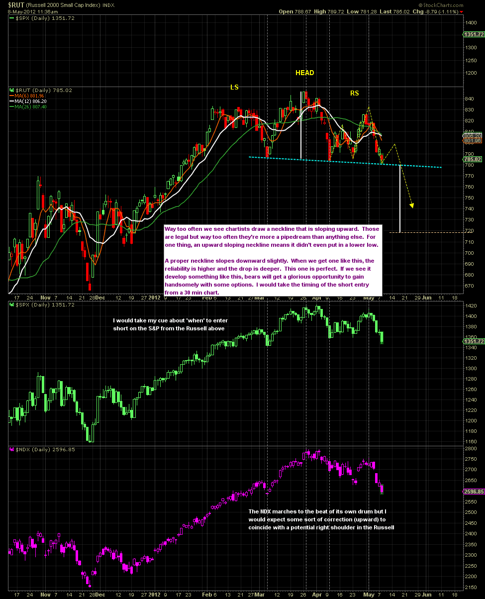
The Russell daily chart below shows the H&S developing very nicely so far. I'd expect a bounce to about 800 before the floor falls out. The measurable target based on the H&S would be around 718 as the 'minimum.