We've moved on to the next pub folks. We're well entrenched in a long weekend, the jobs report was a huge miss and the futures have tanked. We're going to be seeing a bright red week ahead, so what better opportunity to move along to another pub to start off a fresh week than this? We'll move a few of the charts from below to the next post, so let's all meet there. The previous pub session (March 24th) was located here.
So here we are at a
fresh pub since the previous one eventually got boring enough that it emptied out. That's what happens when the blogmeister doesn't provide a daily dose of new charts, visions, predictions and/or wave counts. As I'd stated from the beginning, I am not an EW specialist. This space was created mainly out of my own selfish desire to be able to work in a friendly, troll-free environment. This is where I put together analysis that I find to be quite valuable, complete with the charts that apply to that particular study.. The vast majority of the time it's simply reduced to draft form so that I can easily find it later for reference. It's where I produce and keep my 'stuff'.
Occasionally any articles or rants that I feel I'd like to share end up as an article that I publish here, sometimes with the intention of having it published to a wider audience elsewhere. I'm glad some of you have accepted the
opportunity to exchange ideas in a friendly room. The whole idea here
is to help each other. We act like a team here. Those who opt to
disrupt the team's good karma or whose goal it is to attack others won't
last long in here. To be honest, those who feed trolls aren't particularly welcome here either since by doing so they demonstrate that they don't really care much about being able to operate in a clean office. They're not serious enough about being successful in my opinion. This is a business. So without further ado... welcome to a fresh new pub where you're free to post whatever you
like (within reason... you know what I mean). Let's make some money.
 |
| Grab yourself a cold pint and fire away. |
I'd like to start this one off with a chart that really grabbed my attention this week. This one is courtesy of our friend Pretzel who is in my opinion perhaps the finest all-round talent out there in the world of EWT. In no way is that a slam against any of the other very fine EW analysts out there either. It's simply a reflection of my humble opinion that Pretzel's 'total talent package' is pretty much unsurpassed.
In no way did the author of the chart below suggest that "this is what the count is". It is simply one of the alternatives, one which IMHO seems to have a fairly good chance of representing something fairly close to what might lie ahead. Please take note of the upper annotation on this chart. There is so much wisdom and logic in that thought that it stands to reason that the count below would be just about the most frustrating thing that could ever develop at this dangerous stage of the game. Therefore... that's probably the one! :-)
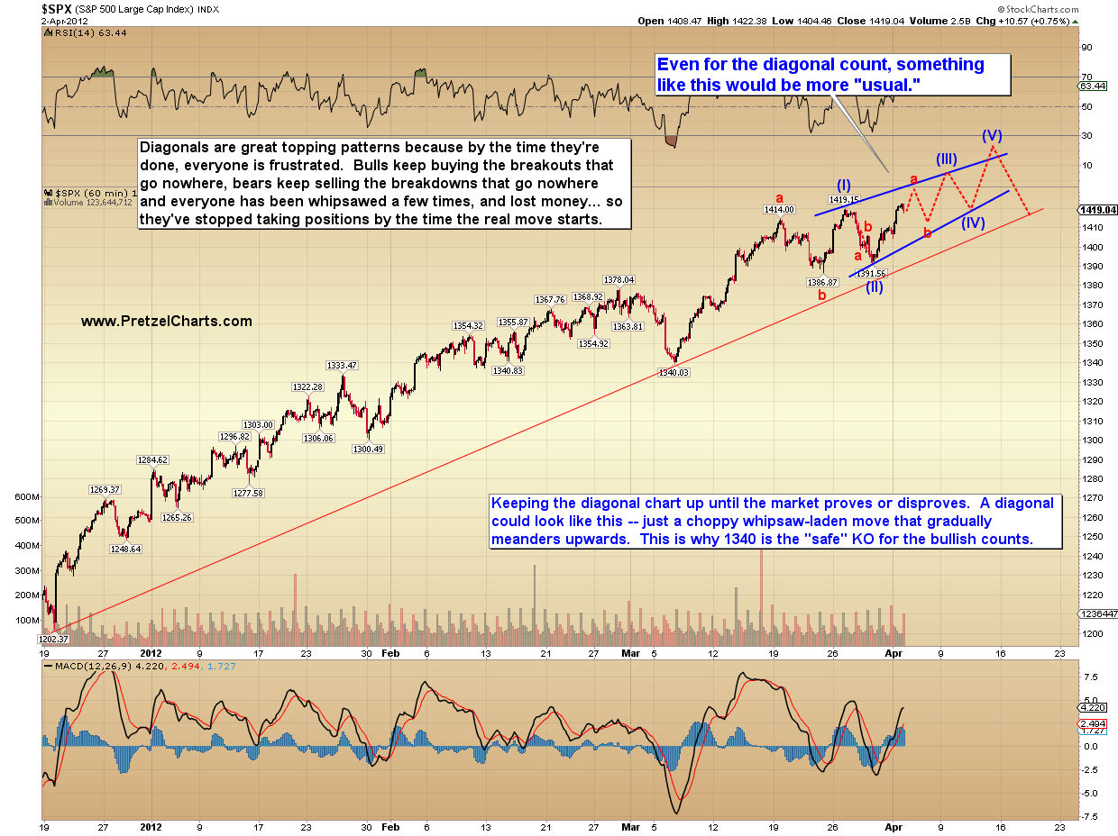 |
| One of several good and reasonable prospects as envisioned by Pretzel Logic. One which represents the greatest degree of investor agony. |
Personally, I can also see the possibility of a H&S emerging which of course would take a few more days to develop properly, and I can also see a perfectly good argument for the markets to head lower immediately on Monday morning. Particularly with the market internals having already deteriorated to such an extent that much more upside could barely be possible with fewer and fewer stocks advancing, or making new highs, or above their own 50 day MA, etc. But the pattern which would provide the greatest degree of "screw 'em all up real good" is represented by the vision above. Until proven otherwise then, I think since the count above represents the greatest possible degree of agony for the masses it is therefore probably very close to the correct count. A special hat tip and "thank you" to Pretzel for his always cooperative nature. Thanks pardner!
In the chart below, we see Elliott Wave Theory at its finest, AR style. In this chart I demonstrate how 1+1+1+1+1=3.
In the chart below, we see Elliott Wave Theory at its finest, AR style. In this chart I demonstrate how 1+1+1+1+1=3.
 |
| One must learn to think outside the box. To the best of my knowledge that's often the only way it works. |
In the chart below we see that we are potentially witnessing the development of one of the best classic H&S patterns in quite a while. Ideally, a H&S pattern should be formed with the right end of the neckline lower than the left end. Such a set-up is far more bearish than one where the neckline slopes up to the right. The Aussie:Yen cross is certainly on the way to forming such a beast and the pattern will remain alive as long as the candles don't rise above the head.
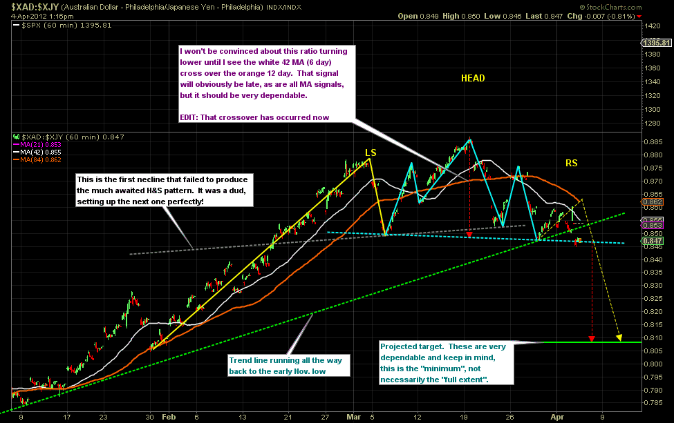 |
| Potentially this could develop into one heck of a nice classic H&S pattern. Almost perfect at the moment. Click here for a live and updating version. If you can't see the annotations, here's the print version. And a much closer look. |
In the chart above, we have a doubly good reason to expect that if the neckline is broken the crash in this currency pair could be very exciting. Here's why. The neckline is already sloping downward. But before the recent low was put in place, there was a previous H&S pattern where the previous neckline was horizontal. Can you see that original grey neckline ok?
So what happened was that in the first H&S pattern the the neckline was broken and undoubtedly some investors were sucked in by it. It was a flop. I'll bet more than just a handful of speculators got caught going short the Aussie and/or long the Yen. I hate to sound cynical, but that is a classic from the Goldman Handbook of Market Wizardry known as Rip Maneuver #666.16HS. The most recent bounce in the pair is currently setting up the final right shoulder. If it works out as planned by yours truly, then the next time the pair drops down to test the neckline it will slice through it like a hot knife through buttah. And of course this produces a measurable move that would drop the pair down to 0.81 'at the minimum'. This is one of the most exciting patterns in all of stockdom that we're seeing developing here. Let's keep our fingers crossed because we can all make some serious dough if this pans out, as a result of its implications. If the Aussie:Yen pair starts to head south with conviction, so will equities with darned near a 99% certainty.
One thing I'm sure all of you know, but I just want to make sure... in no way does this pair know whether or not the Aussie dollar is going to be rising or falling during this entire process. Same with the Yen. All it's saying is that as long as the pair starts to head south to complete the pattern, the Aussie dollar would be under-performing the Yen. In theory both currencies could be rising while that is occurring. Of course the simplest way to get the job done would be with the Aussie falling and the Yen rising. However that outcome isn't necessarily what a "ratio" like this implies. It doesn't know. Nor does it need to know. For the purposes of using this pair as a measure of "risk off" though, it doesn't matter what's happening to the individual currencies. Realistically though, if the pair drops to fulfill the H&S dream pattern, it probably means that the Aussie would be falling and the Yen either falling less hard or perhaps even rising.
This one is getting very, very exciting!
 |
| Look out below. Just a heads up that there are significant air pockets just beneath the market. This situation exists in every single market I can get volume stats for. |
 |
| One of the potentially juiciest set-ups we've seen in a long while is in progress. Probably 'into the gap' and then lower. Click here for a live and updating chart. |
..............


