However, by adding charts on an ongoing but irregular basis to an already existing post, none of the other blog owners nor their readers are being informed about the addition of those charts nor about any of the accompanying discussion surrounding them. The other blog owners and their readers 'want to be' informed, which is why they carry this blog's name in their blog rolls. Conversely, this is why we carry the names of other blogs in our blog roll as well. Whenever a new post is published by 'any' blog, that blog rises to the top of all blog roll lists (where it is listed and where 'feeds' are enabled) as a method of 'alert'. In our case, that alert to our friends is not being issued, which is perhaps quite unfair to the other blogs who have chosen to include this one in their list of associates. They simply are not being told about the additions to existing content.
From this day forward, any charts that are added to an existing "gathering of friends" will also be published as an original post much like our friend Chartrambler does. Each of those new additions will also carry a brief description of the main topic of attention as well as a link to the pub where friends have gathered for discussion about that chart as well as all others that had been posted previously. In this way, the friends of this blog will also be kept up to date to the fact that there are new charts that are available for viewing. And of course, all are welcome to drop in for a cool drink and a bit of chat.
With that said, here is a 60 minute chart of the S&P 500 which shows both the classic diamond pattern that completed on Thursday as well as what the first hourly bar on Monday would look like after Friday's futures action... action which occurred as the western markets were closed for Bad Friday:
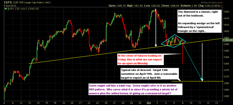 |
| The potential target of approx. 1366 by Wednesday comes from the white arrows, not from the diamond. A more or less typical 'angle of decent' for pullbacks in the S&P is also used in order to make the projection as reasonably accurate as possible. Click here for an updating 'print' version. |
As I'd mentioned, from now on these 'updating' posts will be restricted to the chart itself with perhaps a brief description of it's main theme. Analysis and dialogue about it will be available at the general chat post where friends have gathered for general and ongoing discussion. Of course this chart well appear there as well.
Since this is the first post of this type, I consider it almost as a test post. We will be able to measure its effectiveness immediately as other blog owners and their readers will from now on be alerted in a much more timely manner that additional charts have been included for their consideration.
.....................
No comments:
Post a Comment