UPDATE MAR. 3, 2012:
A few days ago commenter Rob submitted a chart showing a breakout in the USD vs. the Yen which only shows up in a log scale chart. The chart below shows the huge breakout in the dollar that Rob was alluding to:
 |
| Rob's Chart - Weekly USD/Yen. It answers the question "How many Yen will one dollar purchase?" |
A few days later, GregInBaltimore correctly pointed out that my Weekly Yen chart was not showing such a profound breakdown as was Rob's chart because I was using a linear scale. And of course, Greg is right... I should have been using log scales for
charts that display price swings as large as what we're examining here. That's a bad habit of mine... I tend to forget to switch the view to log scale due to the fact that I'm using linear scales (for trading and analysis purposes) 98% of the time. So I stand corrected and am happy to re-submit the Weekly Yen chart (below) covering the same time frame as Rob's chart. Please keep in mind that this chart is of course inverse to Rob's. I will also leave the weekly linear version where it is so that we can examine the difference between the two in the future (if we want to):
charts that display price swings as large as what we're examining here. That's a bad habit of mine... I tend to forget to switch the view to log scale due to the fact that I'm using linear scales (for trading and analysis purposes) 98% of the time. So I stand corrected and am happy to re-submit the Weekly Yen chart (below) covering the same time frame as Rob's chart. Please keep in mind that this chart is of course inverse to Rob's. I will also leave the weekly linear version where it is so that we can examine the difference between the two in the future (if we want to):
 |
| The Baltimore Greg Special - Weekly Yen (log scale). Click here for a live and updating chart which also displays a few indicators. |
And as you can now see, this chart also shows a pretty darned important breakdown in the Yen relative to the American dollar. We're now looking at it in a way where the moves are percentage based and as Greg pointed out, I should have been using a log scale all along.
So what are the implications of this breakout? Here's what I think we're going to see in the future: If we are truly about to embark on a global sized deflationary spiral, the US dollar would almost assuredly be the strongest currency in the world for quite some time to come. But I also believe that the Yen and gold will hold up quite well. In terms of Rob's chart, imagine what the Japanese would be experiencing... 'inflation' in terms of all things priced in US dollars. And of course that would include gold. What a change of pace that would be for Japan, a country that has faced nothing but deflation for the past 20 years as their currency continued to strengthen relentlessly. Consider this... today the Nikkei is at 9777. In 1990 it was at 40.000. How's that for a bout of deflation? Deflation that most Americans seem to think is impossible as long as Bernanke is printing! Japan has been printing for 20 years and exactly how much did that help in driving the Yen lower once their deflationary spiral was ignited? Zilch!
In any event, the phenomenon of other currencies experiencing huge devaluation relative to the USD would be even more profound for those whose currency is crashing even harder than the Yen is. Europe for example! In their eyes, the US dollar would look like a pretty darned attractive place to invest their money if their own currency is crashing relative to the dollar. However, their currency might not be crashing relative to commodities.
We have to keep in mind that when we're talking about the relationship between currencies, we're not considering what they are doing relative to "real stuff", like food. We're only talking about what they're doing relative to each other within the global basket of currencies. A basket that in its entirety has been thrown off a cliff. So we can indeed have deflation in terms of things made of paper, like fiat money, bonds, and real estate. I know what you're saying: "What! You're saying real estate is not a real thing?" When we consider that the value of real estate is only as high as it is due to the effect of massive, massive past inflation in the form of paper mortgages it becomes quite apparent that for all intents and purposes the price of real estate is indeed paper. Yet all the while we can still see inflation in terms of the things we need for everyday survival.
So in the deflationary scenario the problem would be that there would be fewer and fewer US dollars to go around. As an alternative for those people not using US dollars, gold would also look a whole lot better than their own currency. So the demand for gold is likely to remain quite strong during a deflationary phase. There is a theory that in a deflationary scenario everybody will be selling everything they can get their hands on in order to purchase badly needed American dollars. And the argument is that that would include gold. I don't buy that particular piece of that debate.
In any case, what Rob revealed with his chart is actually more profound than I'd realized at first. Thanks to a reminder from GregInBaltimore, I had to revisit that event and alter my chart to show it more accurately (in percentage terms as depicted by a log scale). It appears that the US dollar is gaining more steam than most of us had realized.
In any case, what Rob revealed with his chart is actually more profound than I'd realized at first. Thanks to a reminder from GregInBaltimore, I had to revisit that event and alter my chart to show it more accurately (in percentage terms as depicted by a log scale). It appears that the US dollar is gaining more steam than most of us had realized.
Thanks Rob and Greg... those were two great contributions to this entire topic of currencies.
=====================================================================
LIST OF ALL CURRENCY RELATED CHARTS ON THIS ENTIRE POST:
Australian Dollar - 60 min. - over 6 months - Live and updating version - print version
Australian Dollar - 60 min. - over 3 months - Live and updating version - print version
Australian Dollar - 60 min. - over 2 months - Live and updating version - print version
Australian Dollar - Daily
Australian Dollar - Weekly
Aussie:Yen - 60 min. - over 3 months - Live and updating version - print version
Aussie:Yen - Daily
Aussie:USD - Daily
Aussie:Canadian - Monthly
Euro - by Pebblewriter - Weekly
Euro - Daily
Euro - Weekly
Euro - Monthly
USD - Yen - Monthly Linear Scale
USD - Yen - Monthly Log Scale
Yen - Daily
Yen - Weekly (log scale)
Yen - Weekly (linear scale)
Yen - Monthly
$SPX - some color magic by Zim - 60 min.
=====================================================================
UPDATE FEB. 28, 2012:
When the YEN is viewed as a stand-alone currency it shows very little correlation with the S&P 500. But when used in conjunction with the Aussie dollar it's a gem, since those two have been used extensively in the currency carry trade carnival. So just as we watch the Aussie dollar in a stand-alone chart, it's just as important that we keep our eye on the YEN as well. As I've stated many times before, when analyzing any ratio it doesn't really matter which of the two components is contributing the majority of the action responsible for making the ratio move. As long as a ratio is moving, and as long as that movement correlates, that's all we really need to know. But at the same time, obviously it's to our advantage to know what each of the components are doing and, if possible, to understand 'why' they are moving. In the chart below we see the action in the YEN on a daily scale:
 |
| YEN Daily - Click here for a full blown live and updating version which includes some indicators |
When we look at this chart of the YEN, it's important to grasp the realization that the YEN has been in a solid uptrend since the end of WW2. 66 years ago one US dollar would buy 400 YEN. But the upward path certainly hasn't been without some drama as we'll see in the weekly and monthly charts a bit further below. For now it's very interesting to notice that the upward path of the YEN does indeed seem to have made a rather impressive pullback starting just one month ago. When we consider how long the BOJ has been trying to drive the YEN lower, and how ineffectual their efforts have been, we certainly have to take note of what suddenly occurred at the beginning of February.
But first, we have to consider the incredible drama that unfolded at the time encapsulated within the blue oval. The earthquake and subsequent tsunami caused unthinkable damage to that nation. The first and most obvious effect was the near-instantaneous spike in the YEN as it became evident that much of that currency would have to repatriate. Nearly as quickly, the BOJ announce a massive injection of capital in an effort to drive the YEN back down. Their efforts were soon supported by the G7 which announced a joint effort to sell YEN into the market as well. But within only days, the total impact of those massive efforts by the BOJ and the G7 had run its course. Their efforts had no long-lasting impact whatsoever. These facts are what makes the recent pullback in the YEN seem so much more significant. This pullback is based on something happening within the world of global finance and would appear to be more fundamentally important than the tsunami. Perhaps another tidal wave unfolds but we'll have to watch the YEN over the coming weeks before we'll know.
 |
| YEN Weekly - Click here for a full blown live and updating version which includes some indicators |
When we zoom out and take a look at the weekly chart of the YEN, it becomes much more clear what's going on. Most likely all we're witnessing is another in a long series of pullbacks in an otherwise secular uptrend. I think it stands to reason that the longer blue trend line is probably the target. Bottom line... we'll likely see the YEN hit 122 at some time in March, most likely toward the end of the month.
UPDATE FEB. 14, 2012:
Well how interesting. At the end of today's trading we suddenly find ourselves in a relatively rare situation where the Aussie:USD pair has issued a sell signal for equities while the Aussie:YEN pair has not. In fact the Aussie:YEN, although looking very toppy is simply refusing to roll over and is essentially advising that it's just fine to hang on to long positions. I have always maintained that the Aussie:YEN is the more sensitive of the two to the currency carry trade business and therefore has the better correlation with the US equities markets. The recent action by the BOJ to tank the YEN is a prime example of why I personally have never used the Aussie:USD pair. Those actions by the BOJ have obviously had their effect, as the futures are soaring tonight. It remains to be seen how they open in the morning of course, but as of this moment the Aussie:USD appears to have unfortunately issued a flat out false sell signal while the Aussie:YEN pair has once again proven to be loyal to the purpose for which we use it. Having demonstrated this relatively rare conflict between these two fine indicators, it is still safe to say that although the Aussie:USD has issued the false sell signal, when the Aussie:YEN pair issues its signal, that one will be far more likely to set the bombs away.
I also added the weekly chart of the Euro just below. Whether or not the labels on it and the monthly chart of the Euro are correct is irrelevant since it is good enough to portray my meaning. Any practitioner of EWT can understand what I'm portraying. Further, whether my labeling is correct or not has absolutely nothing to do with my opinion of where the currencies are headed. And of course I retain the right to change my mind in a heartbeat if developments dictate that I do that. For now, here's where I believe the Euro is headed:
 |
| Euro Weekly - Click here for a full blown live and updating version which includes some indicators. The monthly can be found here. |
UPDATE FEB. 12, 2012:
On Friday the Australian dollar made a move lower that we haven't see in quite some time. In fact if you scroll down two charts, you can click the link to the live and updating daily chart wherein I had made the comment "this parabola will not continue". Actually, I'll provide that link right here. I was not expecting that those words would be proven somewhat prophetic the very next day. So it's definitely time to drill down into smaller charts of the XAD and see what kind of analysis and signals we can pick up from there. The next image we'll look at is the 60 min. chart of the Aussie dollar itself (we'll do the same with the crosses very soon). First, I'm going to show it over the course of 6 months just so that we can identify and appreciate the amazing trend lines that are in play. I'll also provide a link to the live an updating version which will not show any indicators. We'll save them for the following link, which will zoom in on the chart and show a shorter time frame. And finally, a third link to a shorter time frame yet. Here we go... the 60 minute chart of the Aussie dollar over 6 months:
 |
| Australian dollar - 60 min. over 4 months. Click here for a live and updating version. For readers who are not subscribed to StockCharts, click here for the "print version" so that you can see the annotations. I believe the print version is updateable, but you have to click the button. |
Click here for the live 2 month version for an even closer look. Click here for the print version if you can't see the annotations.
Now that we've established what has been happening with the Australian dollar in all the important time frames, and in view of the fact that what we're really looking at here is a measurement for the appetite for risk (and a very accurate one at that), we're pretty well set up to monitor it going forward and see what signals it issues. As of this moment, it appears the Aussie dollar has intentions of heading lower. What I'm still quite suspicious about is that it may not be the big one. The weekly chart is still in a very strong uptrend although the histogram on that chart suggests some weakness may be developing on that scale as well.
UPDATE FEB. 10, 2012:
Adding the weekly chart of the Australian dollar into the mix, we have to admit that at this point in time there is nothing to be overly bearish about. True, there is an outstanding negative divergence between price of the AUD and it's MACD. But as we all know, since the AUD is in an uptrend until proven otherwise, bull market rules apply. In that case, we have to ignore the overbought conditions and await some confirmation. For impatient bears, confirmation is unfortunately going to take a few weeks longer. Naturally, when that day occurs it will be weeks late but normally not as late as you fear. Therefore, I have to consider the situation on the weekly chart of the Australian dollar as being quite bullish at the close of this week. What that suggests is that the sell signal issued today on the daily chart is more than likely just identifying a pullback and not 'the' ultimate top. We have no option but to draw that conclusion at this time:
 |
| Australian Dollar Weekly - Click here for a full blown live and updating version which includes some indicators |
UPDATE FEB. 8, 2012:
It's interesting to debate which currency pair, the Aussie/Yen or the Aussie/USD is actually the better of the two regarding the tightness of its correlation with the S&P 500. But the bottom line is that no matter which one it is, the Aussie dollar is the key to both equations. So let's put up a chart of that currency, follow it closely and watch for a sell signal. Thankfully the Aussie is very dependable in its issuance of those gems. Of course it won't necessarily mark the top but will certainly identify when we're about to see a pullback at least. Some traders will choose to consider it as a "stand aside for now" signal and that may very well be the best call:
 |
| Australian Dollar Daily - Click here for a full blown live and updating version which includes some indicators |
 |
| "Miss Equities", 2012 courtesy of Todd Ferguson. Lipstick courtesy of the Federal Reserve |
The Aussie:Yen pair has, for a long time now, been a fabulous measure of appetite for risk. As a result it has also had a spectacular tandem relationship with the S&P, producing signals that have yet to be anything other than bang on the money. And right now, that pair is about as ready to issue a sell signal (to sell the S&P) as at any other time in the past. This thing is ripe. The next turn lower in the ratio should do it. So bottom line right now... watch for the Aussie to start dropping.
I suppose this could be one of those rare occasions when the negative divergences fail to produce the expected result in the S&P 500. But I can't even conceive of any logical reason to expect that an indicator that has been this reliable as a measure of "risk off" for so long, should suddenly fail to tell the truth. It's pretty clear by now that everybody and his dog is completely spooked by the action in equities and have almost come to the conclusion that the FED has literally declared that "down" had been outlawed. I don't care... when this pair shows us that money is suddenly fleeing the Aussie Dollar and is flying into the Yen, there's a reason for it. We will know damned well that fear has re-entered the mindset of the world's largest investors. Equities will fall under that scenario. All we need now is for the ratio to roll over. It doesn't necessarily have to happen, but indications are that it is probably imminent. And when it does, neither does it necessarily imply a crash scenario for equities... although what usually follows is a relatively hefty pullback at the very least. And why not, since it indicates clearly that high risk assets are falling out of favour. Here's the 'clean' daily chart just to set the tone. Click the link beneath the chart to see the full picture, complete with the indicators that issue the signals:
 |
| Aussie:Yen Daily - Click here for a full blown live and updating version which includes some indicators |
The chart below shows the identical set up in the Aussied:USD currency pair. Left clicking on either chart will bring
up the Lightbox feature making it easy to toggle between these two currency pairs for a quick comparison. As you can see, there is very little difference between the two insofar as that they behave almost identically.
 |
| Aussie:$USD Daily - Click here for a full blown live and updating version which includes some indicators |
In the past, more accurate signals actually emerged from the Aussie:Yen pair. One would think that it might make more sense that the Aussie:$USD pair should be the one which issues the more accurate signals. But it also makes sense that the signals issued by the Yen pair could be just as (if not more) accurate since the Aussie:Yen is actually more sensitive to the risk involved in the currency carry trade. In either case, it's pretty clear that the Australian dollar has certainly been the recipient of some pretty hefty inflows during times when investors have felt relatively safe with higher yielding, slightly riskier, currencies.
Ironically, the Canadian economy, which is considerably larger than the Australian, is deemed as being too tightly correlated with the American economy to permit the use of the Canadian dollar in the currency carry trade game. In other words, the Canadian dollar isn't seen as being "risky enough" to generate the profits that can be garnered by trading the Aussie dollar. In fact, a week ago Bloomberg published an article entitled "Loonie Reaches Parity as Aussie Overvalued on China Growth" in which they claim that the Loonie is set for another surge while the Aussie should start heading south due to a perceived acceleration within the U.S. economy while China’s output cools. It remains to be seen whether that surge in the American economy is truly as robust as we're being led to believe. There's just no way the recent job numbers were anywhere close to reality.
Irony of all ironies, any time in the past when we have seen the Australian dollar peak against Loonie, we have found ourselves pretty much smack dab in the middle of a global economic expansion. Or at least an expansion within the US economy (and therefore in the Canadian as well). In the monthly chart below, which shows the price history of the Australian dollar priced in terms of the Canadian, it would seem that perhaps that metric may be about to change. Since the world is no longer on a wild spree of monetary expansion via the magic of fractional reserve banking, very little inflation (money creation) is actually occurring. The entire planet is debt saturated. If it weren't, we wouldn't be seeing half the countries in the Eurozone teetering on the edge of bankruptcy.
 |
| Aussie vs. Canadian Monthly - Click here for a full sized version |
The chart below was submitted by Greenface, with accreditation to Tony Candaro. Regardless of Mr. Caldaro's labeling, the chart for the German mark helps to put the monthly Euro chart into perspective since the Euro has only been in existence since 1991. In the image below we can see exactly where the Euro would tie in with the mark, for the sake of continuity:
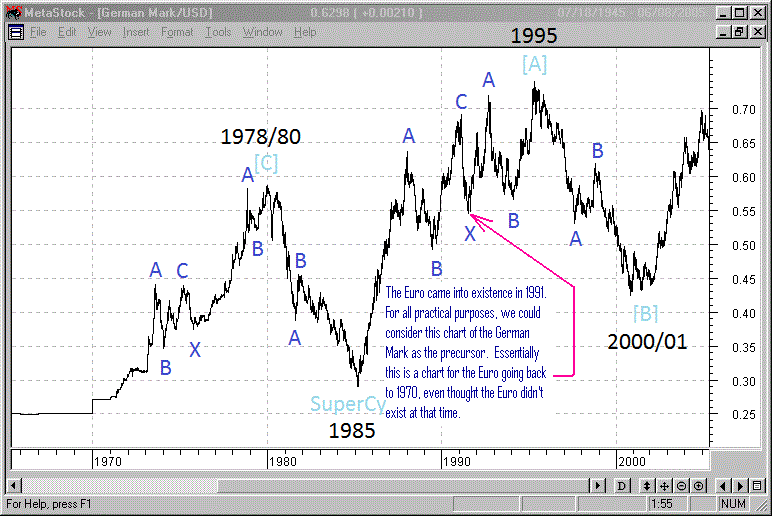 |
| Original image courtesy of Tony Caldaro. Blue annotation by yours truly. Thanks to Mr. Caldaro. |
ORIGINAL POST:
I've been meaning to start a post that's dedicated to the study of currencies but haven't gotten around to it until now. I think I'll keep this post ongoing and growing with regular updates and with the addition of many more charts as we move forward. If the post grows too big I'll start another one and link them together as a kind of ongoing discussion. I've used this method at Seeking Alpha (on a different topic) and it has worked very, very well. In fact it has evolved into a series of posts that is now into its 29th month and still running.
 |
| Euro Monthly - Click here for a full blown version that includes some indicators. The weekly can be found here. |
If anybody else out there would like to submit their own charts with their own counts, feel free. We can even add some of them to the post itself as we move forward. This is another thread that I could certainly see running for 29 months, if not longer. This is all I've got time for at the moment... but it's a start.
.
AR - I don't know if it's in agreement with standard Elliott Wave methods, but if you extrapolate with pre-Euro currencies you can possibly see 5 waves up since Nixon took us off the gold standard & ended Bretton Woods
ReplyDeleteIt may be a legitimate way to look at considering the efforts to create a common European monetary system had its roots decades before the Euro was created
http://en.wikipedia.org/wiki/Snake_in_the_tunnel
http://en.wikipedia.org/wiki/European_Unit_of_Account
http://en.wikipedia.org/wiki/European_Currency_Unit
Not sure the best place to get historical charts of the old currencies or the best way to determine the exact value, but taking a look at the movement of the Duetsch Mark might be the best measure since it had the highest weight.
This chart was from Caldaro's website:
http://caldaro.files.wordpress.com/2011/04/1970duro.gif
So if this is pieced together with the Euro, you get 5 overlapping waves up to 2008, a possible ending diagonal. The end of cycle wave I or A?
Which would make the mess from 2008 to 2010 (if I can borrow Daneric's nomenclature) intermediate (A), (B), (C) of primary [W] and we're now in (A) of [Y] and can expect either another 3 wave move or a triangle, probably just as ugly.
So a reasonable place to look for support would be around the 2000 lows which if I'm reading/extrapolating right would also be in the .618 retracement neighborhood. That would possibly be the end of cycle wave II or B. After that it would possibly be lights out for the dollar.
Or we could be looking at an expanded flat and the Euro gets taken to the woodshed.
Either way the next few years are going to be rocky
Thanks for the perspective Greener. I can see how the chart of the German mark and the Euro would tie together.
ReplyDeleteThe ending diagonal possibility seems more likely since every single larger wave in the entire sequence from 1980 until today is a 3 wave structure. That would explain why the action marked in blue on my chart is also a 3 wave structure... and a 5th leg at that. So it's not a "corrective" as I have labeled it, but the 5th wave an an ending diagonal. If you concur, then I'll change the annotations on the chart to reflect that more accurately.
So let's start with that:
a) would you agree that the blue labeling on my chart is likely the 5th wave of an ending diag?
b) if so, then I'm still relatively satisfied with the projected pattern I've drawn for the possible path going forward, although the labeling is admittedly still up for grabs. I'll certainly change it as required. If the Euro has indeed finished a 5 wave ED upward, then we should be expecting a 3 wave sequence down. That would be what I have tentatively drawn in "red". Could you go along with that?
Sounds reasonable. I would add that I don't expect the Euro high in 2008 to be taken out at least until the 2020s (if ever).
ReplyDeleteAnd also because your yellow 2 would be longer than your green II, I favor the X wave scenario. I would expect rough seas and overlapping waves ahead for the next combination.
OK got the chart up.
ReplyDeleteAlthough I should warn you I'm probably only slightly more careful about my labeling than you are.
Lol... that means you know what you're thinking and there's no need to explain it to the rest of the world. That's kind of the way i work too.
ReplyDeleteOk, I'm thinking that no matter how we label the 2 waves that make up what I now have labelled as yellow A, so often I've seen the following big downward move make a pretty clear fiver. That's represented by the pink labeling. Also, the depth of the pink wave is based on Pebble's faith in crab patterns. If I'm not mistaken, what I've actually drawn is a crab pattern that begins with the yellow B. That is also the reason I have that blue fib lines graphic on there. See where the 0% mark is set? At the top of yellow wave B. Pebble can correct me if in fact it should have started at the very top instead.
Regardless of what you and I or anybody else thinks of the labellings, all we're trying to do here is to try to discern the real future path for the Euro. I think most of us agree that it's going to be "lower". Once we've established that, what I'm trying to accomplish here is to see if we can use the currencies in a way to help us with our trading. I actually still like the Aussie:Yen cross better than any other pair for measuring the appetite for risk. That one and the Aussie:USD next. I'll get those charts up probably by tomorrow.
So if you think the new labeling is reasonable, I'll replace my original chart with the way it looks now. I appreciate your feedback because neither of us claim to be the greatest Ellioticians. We're just trying to establish a base... labels be damned, lol.
Also I agree with your thoughts on the real motive behind the Euro.
ReplyDeleteIt really all started in the 19th century with the Latin Monetary Union along with German efforts to eradicate the silver standard (which culminated in the Panic of 1873).
These were attempts to seize purchasing power away from precious metals and consequently liberties from common people.
Haven't heard much about the Amero lately and I'm glad for that. I think Canada is more linked to China these days for better or for worse.
Since spx 1320 i have heard the tops in and spx should head down big time but that hasn't happened. Today's number suggest that bulls are still in control and that they will try to break the highs placed in on friday.
ReplyDeleteI am wondering what others are thinking...
Mo
http://i39.tinypic.com/wrc6sk.png
ReplyDeleteDo you have a conclusion based on that chart Zimmer? Are you thinking maybe the market heads into that green zone? And ewwwww... what's that furry thing?
ReplyDeleteIt just keeps right on truckin' doesn't it. There's not a damned thing bearish that I can see on weekly charts. I'd say that if Europe doesn't just crash and burn, then it's bombs away to the upside. I don't see how it's possible that equities are rising even as bonds are rising right along with them other than the fact that it's clearly the FED who's buying both. They've admitted as much. So how much longer is the FED going to drive bonds and equities up at the same time? Forever? Looks that way. So I guess it's safe to assume that we'll be seeing $400 oil in the not-too-distant future. That's clearly what will happen if those bastards don't knock it off, but it appears they have no intention of doing any such thing.
ReplyDeleteCanada has actually been very busy forging great trade relations with damned near all the countries on the planet. It's not just China although that trade route is growing as you say. There are a whole lot of other avenues for Canada to take since the US seems so bound and determined to convince us to do just that.
ReplyDeleteMy take is that regaining that 1337.52/1338.76 tl has left the bears praying for a reversal--and any reversal needs to bust through 4 levels (gray 1337.52/1338.76 tl, green horizontal line, gray 1343.31 downtrend line, & the most important lower black channel line) to show it means any business at all (or that this melt-up has any intention of exhaling). Looking at the chart again, maybe I should have drawn the 1338.76/1340.50 tl too.
ReplyDeleteSo, yeah, I'd say the green zone is where it seems to be saying it wants to be going. Hopefully it'll change its tune...
Pray with me for a gap down tomorrow morning through all four (or five) levels?
I've been toying with the idea that the best TA doesn't need words--a little geometry (and maybe a dash of color) can tell the tale. Still toying, as you can see based upon that last chart :P
Anyone who's anxious about the 6.09 points separating the 05/02/11 and 02/03/12 $INDU highs might like this:
http://i42.tinypic.com/2dhtye1.png
I'm also very attuned to volume. I can't buy that there's anything sustainably bullish going on as volume continues to contract so incredibly (not that it really makes the melt-up any easier to watch). If I'm missing the boat on something major, it'll just have to be a learning lesson for next time...
ReplyDeleteThanks for the compliment. I just use Adobe Photoshop to adjust levels & "colorize" but I'm sure there are no shortage of other image editing programs that are capable of simple effects like I've used.
I'm sure you've seen it linked elsewhere, but this was the coolest/most disturbing thing I saw today:
http://i.imgur.com/DxWer.gif
That was my exact thought this morning when I saw bonds and equities went up together. WTF? Somehow I feel that the FED might be shaking in their knickers, whenever yield rises, they tries so hard to keep it down. That really is telling on how bad the debt situation is, pretty soon the interest paid will be so monstrous that even the printing press might not be enough....crazy thoughts!!
ReplyDeleteYeah I saw that thing on ZH. I'm not sure I know what it means other than to show traffic between the NYSE, Nasdaq and clearing houses (I think that's basically what BATS is). Bot traffic... it's freakin' insane really.
ReplyDeleteI've never gone to the trouble to learn about image editing tools. Hell, I can't even get Paint to work right. That's probably because it's the most archaic, useless tool out there. Next to Wagner.
Yeah for sure... the FED is buying bonds to hold rates down and at the same time, their primary dealers are jacking equities up and up and up. It's just an illusion. It's gotta be.
ReplyDeleteI agree, I think the FED is scared shytless to be honest. They really 'are' on panic mode in my opinion. It's gotten to the point that there is so much sovereign debt out there that a hike in rates of even 1% would bankrupt half the countries in Europe almost overnight I think. They have absolutely no choice now but to continue to "buy rates lower" until they can't do it any longer. I think at that point the bond markets collapse and rates go through the roof which causes even more defaults and bankruptcies. A great big debt snowall slamming up agains the concrete wall at the bottom of the hill.
Rising rates during a deflationary scenario? Now that's a rare and scary event. It sounds to me like a total collape in the global monetary base as money disappears right off the planet, back into the imaginary void that it was born from in the first place... loans. The loans collapse and the money that resulted from them vaporizes... forever. I don't see how even ten times as many money printing presses could deal with a collapse of that magnitude. Yet, logic says that's where we're headed.
http://www.rationalinsolvency.com/2012/02/spx4mo020612.png
ReplyDeleteupdates this:
http://www.rationalinsolvency.com/2012/01/spx6mo013112.png
Your techniques are starting to spook me out. Very nice!
ReplyDeleteA lower US dollar is very supportive right now for US equities and commodities. The lower dollar, however, is accompanied by higher US rates. Most peculiar momma. Long ULE and TBT.
ReplyDeleteThe market's making the picture books--I'm just coloring between the lines!
ReplyDeleteThat lipstick looks good! But I thought red was no longer allowed? I was told to remove it from my crayon box, anyhow. I keep hoping it might be useful again someday. Ah, someday...
ReplyDeletehttp://i43.tinypic.com/j5h4d5.png
Again, that's another outstanding use of color Zim. I just don't see anything is the whole wide world that is going to cause price to drop into that banned red zone. The market just doesn't care. It has become apparent to me that there is no news that is ever going to be bad enough to turn equities south. Somebody in the shadow banking system (or somewhere, maybe on planet Pluto) has decided to drive this market to S&P 2000 (triple 666) and it appears they're going to do it in one straight line. "How bizarre. The spring of 2009 all over again it seems.
ReplyDeleteI hadn't thought about the 666.79 x 3 = 2000.37 bit. I'll have to play with that & see if I can find any Fib extensions.
ReplyDeleteI agree, it feels like those run-ups that started in 2009. There's one that's bugged me for a couple of weeks now, here in Market Anthropology-style:
http://i39.tinypic.com/69m935.png
Some excerpts from EWP:"B waves are phonies." (81)
"If the analyst can easily say to himself, 'There is something wrong with this market,' chances are it's a B wave." (81)
"NARROW, EMOTIONAL ADVANCE Technically weak, selective. Results in non-confirmations. Fundamentals weaken subtly. Aggressive euphoria and denial." (82)
"B waves of Intermediate degree and lower usually show a diminution of volume" (83)
I wish it felt like 1996 instead. I'd be able to enjoy OMC so much more too...
Excellent analysis AR - Here's a couple YEN, buy yourself a beer or tuck it under your pillow!
ReplyDeleteThanks KB. I'm more or less just rambling with this post, without any real plan. I expect that I'll be adding more charts and commentary on a "when the mood strikes me" basis. But when I do that, I make a comment up near the top of the post that says I've made the update. That way, people can see them (the update notices) over in the right hand side bar (in the "popular posts" section). Those posts in that section shift up and own in the list as interest rises or falls in them. Same with the "blogroll", where the blog owner who has made the latest entry on his site rises to the top of all the blogrolls in the universe, lol.
ReplyDeleteHang onto those Yen for me... I need to add a "donate" button first, lol.
I'm going to sound like a broken record: Photoshop.
ReplyDeleteThis guy:
http://www.marketanthropology.com/
Frequently uses similar layouts, except, well, his are professional looking...
Oh... you made that chart too? My apologies, I wouldn't have asked the question for the turd (3rd) time had I known it was your chart. Sorry 'bout that Zimmer, lol.
ReplyDeleteThanks for the link. I've been there before but failed to bookmark it.
Well you're doing a fine job.
ReplyDeleteWhich pair is the better Risk-O-Meter? AUD/JPY or AUD/USD? IMHO it is a close call.Photo finish!
ReplyDeleteI lean toward the AUS/JPY as being the more accurate, especially on smaller scales like intraday. I think it's also the pair that's going to be hit hardest if the currency carry trade business suddenly finds itself in a "have to unwind and fast" scenario. IOW, if a true deflationary scenario unfolds, I think the AUD/JPY would reveal it first and react the hardest. But until that day comes, yes I'd agree... it's darned near 6 of one and half dozen of the other. The way things are looking right now, there is no deflationary scenario in our future. I just can't believe I said that because it's impossible. But hey... they've got me convinced pigs can fly.
ReplyDeleteInteresting point to zoom in on intraday time frames. Still very close in tandem/non-tandem behaviour. Decoupling seems to "just" happen, like we did see before. I compared on 1min, 15min, 30min and 60min charts.
ReplyDeleteBy coincidence I looked at SPX compared to SPY. At first I was puzzled, thinking I checked SPX one to one, until I saw the Y. That's almost 100% tandem, as it is supposed to be, right?
Oh yeah, pigs do fly. Of course they can. http://youtu.be/CXa7G3kQKLY
I've got a plan. Rather than debating which pair has the "better" relationship, let's just recognize that no matter which one it is, the Aussie dollar is involved. So let's just watch that instead, lol.
ReplyDeleteNo worries!I cleaned it up a bit:http://www.rationalinsolvency.com/2012/02/spx020812_2010analog.png
ReplyDeleteWhen will Prechter fall on his sword and admit that we're in a new bull market?
ReplyDeletehttp://chartistfriendfrompittsburgh.blogspot.com
There's been a pump and dump pattern showing up over the last few days...especially wrt the dump at the end of the day.
ReplyDeleteThis is a bit off topic but I think AAPL is at a long term bloow top here. The market has lost sight of the fact that AAPL has had almost total domination of
ReplyDeletethe tablet market. That's all about to change very rapidly as Samsung is
winning in it's legal battle over AAPL in every country the case has
been heard.
I know somebody that has used the SS Galaxy and says it leaves the iPad for dead.
This is a long term blow-off top in AAPL IMO and the chart looks scary to say the least and as far as the broader market is concerned just about every sentiment indicator ever devised is flashing MAJOR top.
And how do the bulls respond?.........Exactly how they always have at EVERY other major top.
Be vewy vewy careful here.
Cheers
I have a hard time with the "new bull market" argument, not because I care about Prechter, but because outside of charts, there's nothing in the economic landscape to support the claim.
ReplyDeleteThe housing market is still in decline, leadin the bank balance sheets farther into the abyss (if banks had to adhere the standard accounting practices the TBTF banks would all be in receivership). Add the declining employment picture into the equation, that means fewer people buying fewer products, which squeeze margins and reduce topline growth. Add the worldwide sovereign debt issues, especially in the US, and I fail to see how any REAL economic growth happens in the foreseeble future.
I look at market darlings like AMZN trading at a PE of 135 with a 2% margin on declining revenues and can only shake my head in disbelief. I look at the imploding BDI and again, I shake my head in disbelief.
So my question, Prechter aside, outside of a couple of charts, what's the economic argument for "the new bull market"?
That sure looks like Larry Sellers homework.
ReplyDeleteGood plan, AR. The last couple of days did their QED for your update! Anyone keeping an eye on the Aussie got a good warning ahead. Very nice indeed.
ReplyDeleteLooks as if the FBI will be shutting down a lot of corporate and govenment servers early next month. Google: 'fbi dns servers' for more info.
ReplyDeleteHey AR, this is GregInBaltimore (not kathygreg) ...
ReplyDeleteExcellent topic thread, thanks for adding the currency slant, most excellent. And as TBONE said, we're all currency traders now! My first thought on that weekly AUD chart was OH SHIT ... nothing bearish yet?! I'm thinking on the daily and hourly, we've already got 1 and 2 of some degree in of Primary 3. On Darkest Knight's count. But that doesn't show up yet on the weekly. But then looking back at the prior wave down in 2008 and summer of 2011, those seemed to come all of a sudden also. So anyway, what would it take for the weekly chart to turn bearish? I appreciate your views, and will watch my short very closely.
Also I wanted to throw into the mix that you make a very good point about the market needing to show some proof of weakness before you believe it. You made that point a year ago also, and it was very timely then too. But THIS time I think we are very close to a brick wall decision point. We have another wind sock to look at ... the alleged primary 2 peaked at 137.1 or so (SPY), and we got as high as 135.something. So I'm betting we don't pierce that 137.1 .... Like a 99% retrace is IT -- FINIS. Can't see us taking out that high -- all that volume selling in Minor 1 of P3 has to mean something. And I think the AUD/USD on Thursday night when it broke the uptrend line since mid January is an early sign that things are about to roll over. So I'm short AUD and long TVIX, and I'll exit both if SPY breaks that high. As Dan said, there's about to be no more room left for this count to be valid. So I'm betting the count is right, and we'll find out very soon -- I think it's a low risk high return set up. Huge area below where we are and a tight stop if it moves up from here.
Anyway, great to read your stuff as always, and sorry it's taken me awhile to make it back here ... must have been staring bleary-eyed at the damned aussie for too many nights as it seemed near the mountain top last week. Then the drop from 1.084 to 1.064. I do share your mistrust of this equity market tho ... but at some point big monied investors are going to front run the big banks and short the hell out of the AUD/USD, and the AUD/JPY and force the unwinding of those carry trades. It'll drop quickly like the 2008 plummet.
I read your comment this morning Warren, but I was just headed out the door for 10 hours. But geez, no sooner had I read your comment than I noticed that Iran has basically shut down its own internet. They just don't want the citizens to be able to assemble a revolution that they fear is coming. I know a young Iraqi man at work and two days ago he told me that the people of Iran would have a revolution "this year". Wow! Maybe he knows what he's talking about... and apparently so does the administration.
ReplyDeleteI did google 'fbi dns servers' but to be honest I haven't seen anything overly ominous there. Maybe I'm missing something, but it just seems to me that they're warning us... or are trying to catch some bad guys who can apparently hijack a dns server. To be honest... I smell a rat. I think there's an equal chance that it's a smokescreen... a false flag sort of deal so that they can justify messing with our own internet in the not-too-distant future. Jay Rockefeller said that "the worst thing we ever did was to invent the internet". By "they" he means the elite ruling class. He is doing everything in his power to shut it down. The dirty rotten bastard.
I see a few potential harmonic patterns, but the flag is probably the strongest determinant of price action we have going for us IMO. Here's a chart with the three most prominent patterns: (1) biggest is Butterfly (yellow), (2) medium is a Crab (purple) and (3) smallest is also a Crab (red.) There are lots of alternatives, but I like the big Butterfly best because it lines up nicely at the 1.272 with the bottom of the flag pattern.
ReplyDeleteHey AR, nice post. I see a few potential harmonic patterns, but the flag is probably the
ReplyDeletestrongest determinant of price action we have going for us IMO.
Here's a
chart with the three most prominent patterns: (1) biggest is Butterfly
(yellow), (2) medium is a Crab (purple) and (3) smallest is also a Crab
(red.) There are lots of alternatives, but I like the big Butterfly
best because it lines up nicely at the 1.272 with the bottom of the flag
pattern.
Also, check out the full Stochastic on the AUDUSD weekly chart. Looks about ready to cross, IMO.
Best regards
Thanks Pebble and thanks for your contribution. I've just put together a list of all the charts on this post so we can find them easily rather than having to scroll down to find the links to whichever chart we want to see. And of course, your chart is in the list. Your opinions are always welcome and we value them... always.
ReplyDeleteYeah, like your yellow pattern but I have to admit that I'm a bit concerned with the fact that the moving averages on the weekly chart for the Euro have rolled higher. The stochastics and MACD have rolled higher as well. But it's no surprise that they've shot higher even though the recent bounce in the Euro is mild. That's pretty common after a currency has tanked for 6 months straight like the Euro has. So the recent bounce in the Euro might just be something like a wave 4 bounce developing. Nonetheless, at the present moment the weekly chart of the Euro is turning somewhat bullish. I doesn't like that. Be that as it may, I'm wondering if the bounce in the Euro might take it quite a bit higher than where your white 'C' currently is.
About the Stochastic on the AUD:USD... I'm not seeing which cross you're referring to. On the AUD weekly chart, the full stochastic is just barely getting into overbought and doesn't look like it's about to roll over as far as I can tell. But you said the AUD:USD, and on that chart (weekly) the full stochastic is at about 90... just approaching 'overbought'. So I'm not really understanding what you're referring to. I haven't posted the weekly Aussie:USD cross yet but I will as soon as I can find the time to focus on it. We can pick it up from there, lol.
Let's hope it's a good week and that the markets truly understand what the Greek decision means. It means Greece just borrowed another $200 billion that they can't afford and will now surely default whether they want it or not. It's just deferred another two months or so. Jesus, the madness just continues doesn't it?
The location of C isn't that important, as long as it doesn't exceed A. It can be anywhere from 23.6% to 100% retrace of AB. This means we could get back to 1.4939 and still have an intact Butterfly pattern -- although the smallest Carb pattern would invalidate at 1.3532 and the medium Crab at 1.4246.
ReplyDeleteAgreed re the Weekly Euro chart -- the bearish case isn't so clear, but daily STO's crossed. Here's the AUD weekly STO. With the limited action on the futures so far, it looks to me like AUD, EUR and ES are all setting up for a .886 retrace off the recent highs (1.0886, 1,3285 or 1.3301, 1349.32). But, we'll have to see how things shake out during market hours. If the rally holds under 1350, it would look good for the H&S top on SPX.
I've been kinda busy, myself...
ReplyDeleteIf the articles I've seen are anywhere near correct, shutting down the internet access for even a small percentage of corporations or government servers in America could have a dramatic impact on the market. If there's any kind of a dnschanger trojan on their servers -or a computer- they'll get shut down. The claim is that over fifty percent of government and corporate servers are infected.
How will it play out? I dunno...but the FBI appears to be serious about it.
Geez... the potential for that to be a game changer of gigantic proportions is just scary. But I'm being very serious about this... I think it will be a planned event. Just as in every other case where an event happened, including 911, the spin monsters first plant the seed in our brains that "if something happens, it will be the terrorists, not us". We've seen that type of horseshit happen going back 2000 years or more. What a wonderful excuse to blame the terrorists for a collapse in the financial system. A collapse that we know with 100% certainty is coming. In any event, no matter who deliberately starts screwing with the internet, it's is indeed going to be a huge event (or series of events). Thanks for bringing up the topic W.
ReplyDeleteA Rocks
ReplyDeleteTSE- FTSE- DAX- CAC- NIFTY- AORDShttp://markethighsandlows.wordpress.com/
Scotty, your comment was edited only to the extent of making your link work. I'm just heading out for the evening but I'll take a look at your work as soon as I return.
ReplyDeleteI've been watching these fan lines for awhile now:
ReplyDeletehttp://www.rationalinsolvency.com/2012/02/spx3mo021412mff4.png
The bounce into today's close also coincided with reaction to the orange line from last Thursday/Friday:
http://www.rationalinsolvency.com/2012/02/spx7d021412j.png
Hi Zim. I've always had a hesitation to put much credence in Fib fans but others swear by them. But I also didn't realize that the uptrend line that you've highlighted so beautifully on your first chart is the .2361 fan. That's freaky interesting.
ReplyDeleteCheck this chart out too. I just posted it at troll central, but I have a dozen more that are pretty much at the same precipice. Unless the power brokers can keep levitating the markets until this type of chart has a correction and then continues higher to form a neg. divergence (which has happened before), then the market is done:
http://stockcharts.com/h-sc/ui?s=$NYSI&p=D&yr=1&mn=0&dy=0&id=p71167404023&a=211213667
Good stuff. I didn't intend to suggest Fib fans are the philosopher's stone; only that the seemingly important line is just one more rock we can add to the pile. When the timing is right, the pile will be heavy enough to sink the raft that's kept the market floating. It seems to me that there are a lot of rocks...I updated a familiar guy:http://www.rationalinsolvency.com/2012/02/spx4mo021412.pngCheck out where today's afternoon bounce started & where the close was!
ReplyDeleteGood stuff. I didn't intend to suggest Fib fans are the philosopher's stone; only that the seemingly important line is just one more rock we can add to the pile. When the timing is right, the pile will be heavy enough to sink the raft that's kept the market floating. It seems to me that there are a lot of rocks...
ReplyDeleteI updated a familiar guy:
http://www.rationalinsolvency.com/2012/02/spx4mo021412.png
Check out where today's afternoon bounce started & where the close was!
Zimmer, I only edited your comment to make the link work... before I realized that you resubmitted it with the link fixed.
ReplyDeleteThat's awesome stuff man. I've become so jaded by the market action that I'm almost expecting that the indicators won't work. Of course they work... they just might have to go through a bit of a bounce in order to develop a neg. divergence. I dunno man, but the air sure is getting thin up here.
Thanks AR!
ReplyDeleteAR, perhaps I'm totally lost on this one. Just checking my whits, so to say :)
ReplyDelete1. $XAD, $XJY and $USD are all nominated in US Dollars (=$one).
2. $USD, the US dollar index, measures the performance of the US Dollar against a basket of currencies: EUR, JPY, GBP, CAD, CHF and SEK, so $USD == $one would be a great coincidence.
Algebraic:
Aussie:Yen pair: $XAD/$one : $XJY/$one == $XAD/$one x $one/$XJY == $XAD/$XJY and
Aussie:USD "pair" : $XAD/$one : $USD/$one == $XAD/$one x $one/$USD == $XAD/$USD == $XAD/(basket of 6 currencies)
I say "pair", because Aussie:USD isn't a real pair, right?
So, in the Aussie:USD "pair", aren't you basically comparing the Aussie against a basket of currencies? Why take this basket and not "just" $XAD, which is the value the Australian Dollar in US Dollars (in other words $XAD/$one)? The Aussie:Yen pair is after all the value of the Australian Dollars in Japanese Yens.
But, like I said, perhaps my mind looks like a maze right now...
If pairs and baskets don't strictly trade on rationally mechanistic fundamentals, perhaps the walls of the maze are a bit porous...
ReplyDeleteSymmetry is a beautiful thing:
ReplyDeletehttp://www.rationalinsolvency.com/2012/02/spx4mo021512.png
More ways to focus on 1340 over the next two days:
http://www.rationalinsolvency.com/2012/02/spx2mo021512ff.png
http://www.rationalinsolvency.com/2012/02/spx7mo021512.png
At Friday's close, the lower green "channel" line almost exactly intersects the orange "no bears allowed" line:
http://www.rationalinsolvency.com/2012/02/spx7d021412j.png
Hey JW. I hear you loud and clear. I think I understand exactly what you're getting at. In fact I've had to work through all that myself.
ReplyDeleteYes, the $XAD, $XJY and $USD are all priced in terms of the US dollar. So is the Canadian, and I"m all too familiar with that ratio. When the Canadian dollar is priced at .93, that means our dollar will only buy 93 American pennies.
I can understand the math you put forward and your math is correct sir, lol. But it's not quite a situation where we can apply that type of math, although the algebra you put forth sounds completely logical.
Here's an example that works. Use this to help us along:
========
One XAD is worth $1.069 USD. So it takes the reciprocal of that, 93.5 cents Australian to by one USD.
The YEN is currently sitting at 1.2748 but that doesn't mean a YEN is worth $1.27 USD. A YEN is worth 1.2748 pennies. So if we think of it in terms of the YEN being priced at 78.74 YEN to buy a dollar....
Therefore, if 78.4428 YEN are worth one USD and .935 Australian dollars are also worth that same US dollar,
Then the .935 Australian dollars must be worth 78.7428 YEN. That would make one full Australian dollar worth 84.21 YEN. And it is.
LOL. That's not nice. It's funny but it's not nice. Or maybe it's me who's got shitferbrains. Let me think on it:
ReplyDeleteVery nice charts Zimmer. I noticed that on your first two charts of the S&P you've got a dead vertical line at the end of those diving boards. I don't think the market drops that far that fast tomorrow, lol.
ReplyDeleteOn your 4nd chart (lol), where you've drawn the "no bears allowed" line... the futures are sitting right on it, right at this very moment. I wonder if it'll hold in the futures and they recover to open in the green. Christ I hate to think so but it seems that's just par for the course.
TrendXplorer: No insult of the maze container intended--only offering an alternative view of the construct within it!
ReplyDeleteDead vertical?
ReplyDeletehttp://www.youtube.com/watch?v=Cu5jGnXOFgc
Zim, no offense taken.
ReplyDeleteAR, thanks for taking time in explaining. Your preference for Aussie:Yen seems to pan out. The Aussie:$index signal was likely a fake out.
ReplyDeleteNow I only have to get my fruitbasket to line up nicely, lol
Fanlines trying to choke the SPX out?
ReplyDeletehttp://rationalinsolvency.com/2012/02/spx3mo021612ff.png
http://rationalinsolvency.com/2012/02/spx3mo021712mff.png
Looking at your first chart it's pretty difficult for me to imagine any case for the S&P to start accelerating higher from here. It looks utterly exhausted.
ReplyDeleteYeah, regaining that 0.618 fanline would seem to require a second (third? eighty-fourth?) wind indeed.
ReplyDeleteAR, thought you might appreciate this USD/JPY chart. Shows a clean breakout after a 5 year downtrend. If this thing starts rocketing up, could cause some strange behavior in the markets.
ReplyDeletehttp://dl.dropbox.com/u/59021800/Yen1%202012-02-26-TOS_CHARTS.png
I was going to mention that chart ... I thought maybe yours didn't show the break out because your chart was linear values on the axis rather than logarithmic, but that breakout is probably causing many shorts to cover ... a huge reversal in trend as you say -- more significant than was the earthquake!
ReplyDeleteWow ... the Baltimore Greg Special ... I'm truly honored.
ReplyDeleteI only mentioned it because the USD:JPY charts I've been marveling at the move were clearly way above the 6 year downtrending wedge line. But in retrospect, I think it's because they were also one week more recent. That damned thing, I was there when it broke out at 76.30, even bought it right there. Even was aware of the significance of the rarity of breaking out of the 6-10 year trend. But sold it for 100 pips. to go get thrahsed around by the AUD/USD. Lessons learned. It's up 7% since then which leveraged 25:1 becomes adds up after awhile. But I await the pull back. I still am not sure what it means. Is it just the intervention started an avelanch of short squeezing? Granted the Japanese being an export economy would like a weak currency. But is this a sign the US debts are being destroyed faster than Japanese debts?
A very good discussion by the way with things relative to each other ... I find this currency thing takes time to get comforatable with what it means. Thanks!
ReplyDeleteThis was meant to be replying to AR :)
ReplyDeleteNo I don't think we could go quite that far Greg, to say that the chat implies that US debts are being destroyed faster than Japanese debts. We're really only talking about the relative strength between the two currencies. The actual demand for the US dollar could be coming about as a result of the horrible situation in Europe. Credit contraction over there will also cause a mad scramble for American dollars since a lot of the debt is denominated in USD. Otherwise we'd see the Euro rising as they experience deflation. Instead we're seeing the Euro fall... relative to the USD. So I think the demand for the USD will just grow stronger and stronger as more and more countries in Europe start to implode. Eventually it will be American debt that gets destroyed in an identical fashion. But I've been saying for a couple of years now, I think the USA will crumble last. In the meantime, the chart we're talking about is showing debt destruction, but not US debt destruction.
ReplyDeleteLol... Roger that!
ReplyDeleteThat helps get my arms around the currency relativity.
ReplyDeleteOh, that's right ... I did read somewhere that most of the global debt is denominated in dollars.
This morn
ing I woke up wondering about the USD/JPY again ... how does it fit with the yen carry trade of many years? How did the US dollar get so weak relative to the yen ... maybe it was our credit expansion that dilluted the dollar for all those years? But weren't people borrowing yen at 0.x% and buying other things for years? Wasn't that yen weakness? And are they doing that again now and buying the AUD (which is spiking)? Or maybe thats what the BOJ is buying ... dollars and AUDs.
But as you say, if there is a mad scramble to get dollars that would explain the USD/JPY recent spike. Maybe that's all the fundamentals necessary (and the speculators are gonna jump on a breakout like that ... the term avalanch comes to mind ... now the trend is self-sustaining) -- I was just curious what was going on the past 6-10 years that the opposite trend was in place.
Curious times ... before the yen would spike when it was risk off (2008). But then it rose since then (I guess the yen carry trade wasn't the driving force since then ... but probably the dillution of the dollar with the FED balance sheet exploding). But now it's plummeting ... and it makes it appearlike risk is ON when you look at AUD/JPY ... but a stronger USD/JPY could help unwind the dollar carry trade -- AUD/USD. Risk OFF.
Oy. I'm feeling dizzy. I need to go for a run and clear my head from the currency gordian knot.
Your scenario about dollars being in demand as the EU implodes sounds like it fits. Makes good sense ... they are probably gonna want out of that currency. Looks like it's ready for another wave down, that EUR.
ReplyDeleteAR, thanks for the mention in your post! I actually put together a summary as to why I think this could be "it" for the Yen and why the USD/JPY could be rallying for the next year or so with some macro elements. I am not trying to lure people away from your blog, the post is just meant to be informative as to why the USD/JPY should rally and rally very significantly. If you wish me to remove the link, I will do so at your request! Thanks again AR.
ReplyDeletehttp://silversaxena.blogspot.com/2012/02/japan-black-swan-rising.html
Also check out this chart of the GBP/USD, it is coiled to breakout after a 5 year consolidation period. It may not be only the BOJ that will soon be in trouble with a rapidly devaluing currency, but the BOE may suffer the same fate as well if the USD comes into significant demand after this week's Europe shenanigans.
ReplyDeletehttp://dl.dropbox.com/u/59021800/GBP%202012-03-06-TOS_CHARTS.png
Rob, do you mean you see the Pound weakening? That's what I think is coming. When you said "coiled to breakout" I take that to mean you think the Pound is about to gain strength against the USD? Yet jusging by the rest of your comment I don't think that's what you mean. Here's what I'm thinking about:
ReplyDeletehttp://stockcharts.com/h-sc/ui?s=$XBP&p=W&yr=6&mn=0&dy=0&id=p87836037123&a=260035706
Is that what you're thinking about... something like that?
That's exactly what I'm talking about. Didn't mean to confuse, I was just using coiled in the sense that when it breaks out (most likely to the downside), it should be a very powerful move. And thanks for the comment above, we're all just trying to help each other out!
ReplyDeleteHello there, I discovered your website via Google even as searching for a related
ReplyDeletetopic, your site got here up, it appears good. I have bookmarked
it in my google bookmarks.
Hi there, simply was aware of your blog thru Google, and found
that it is truly informative. I am going to watch out
for brussels. I'll appreciate for those who continue this in future. A lot of other people will likely be benefited from your writing. Cheers!
Feel free to visit my website : http://www.embeddedant.org/wiki/index.php?title=Straightforward_Plans_In_GNC_Coupons_-_What_s_Needed
I all the time used to read article in news papers but now as I am a user of net thus from now I am using net for posts, thanks to web.
ReplyDeletemy web site ... www.hr-pedia.ru
These are in fact great ideas in concerning blogging. You have touched some
ReplyDeletepleasant points here. Any way keep up wrinting.
Also visit my blog post: seo companies
I сould not refrain from commenting. Veгy well written!
ReplyDeleteAlso viѕit mу homepage; eca stack cycle
What's up friends, pleasant post and pleasant urging commented at this place, I am really enjoying by these.
ReplyDeleteMy homepage :: designer checks
Hello! Would you mind if I share your blog with my zynga group?
ReplyDeleteThere's a lot of folks that I think would really enjoy your content. Please let me know. Thanks
Visit my web page what is a graduate certificate
Do you have any video of that? I'd want to find out some additional information.
ReplyDeletemy web blog ... http://ebuybelize.com/
I'm gone to convey my little brother, that he should also pay a quick visit this blog on regular basis to obtain updated from newest gossip.
ReplyDeleteMy weblog :: http://ea.dev.ticcon.net/
Magnificent items from you, man. I have bear
ReplyDeletein mind your stuff previous to and you are
simply too magnificent. I actually like what you've obtained here, certainly like what you're saying and
the best way wherein you assert it. You're making it entertaining and you continue to take care of to stay it smart. I cant wait to learn much more from you. This is really a tremendous site.
my website - click through the next document
I must thank you for the efforts you have put in penning this site.
ReplyDeleteI am hoping to see the same high-grade content by you later on as well.
In truth, your creative writing abilities has encouraged me to get my own site now ;)
My weblog: just click the up coming internet page